Tuesday, 25 November 2014

Module 2 Chapter 8

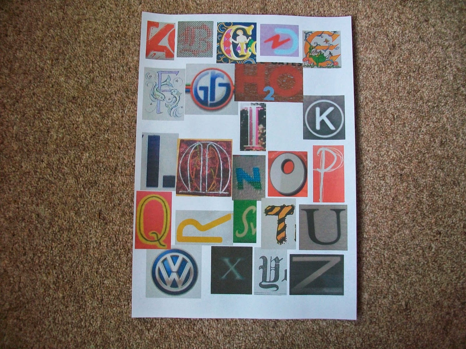
I started doing this chapter in the summer, just taking photographs as I saw things.  One or two other people got involved and they enjoyed looking out for things.  I was quite suprised when I started putting it together that I was only about 5 letters short of a full alphabet.  I have to thank a friend of mine, Hazel, who has done this exercise and posted it on her blog.  I did take a look to see where she had got her ideas from and I did steal the brickwork one.  Here are my photographs and where they came from.  I had a bit of trouble putting the pictures on randomly so I found this template but there was only room for 25 so I had to tage Z on the end.


A - Bird scarers     B - Wroght iron gate       C - Radiator       D - Garden seat side on
E - Electric fire decoration        F - Brickwork        G - Sewerage grating        H - Brickwork
I -     Wooden post         J - Wrought iron fence       K - Canes on garage floor     
L - Window architecture       M - University architecture         N - Fencing      O - Bungalow window
P - Sewing machine thread guide         Q - Wardrobe door handle upside down    R - arranged fabric
S - Wall bracket       T - Shovel handle       U - Horseshoes        V - Bracket on telegraph pole side on
W - Heraldic device      X - Gate         Y - Pickle fork       Z - Road sign side on


The next set I managed to arrange randomly.   I could have done the whole alphabet from 1960's/70's LP sleeves, they are so colourful and imaginative.


A - Tag Heur logo       B - Embroidered sampler       C - Children's theatre poster      D - Damart logo
E - Title page in book (Eire)     F - Illuminated latter        G - Great Railways Journeys log
H - Record sleeve    I - Record sleeve       J - See 'G'        K - Newspaper advertisement
L - Tate & Lyle logo       M - Embroidered letter       N - 'Indigo'  clothing range      O - Oxo logo
P - Part of Tag Heur advertisement       Q - Theatre Poster       R - Regatta logo    
S - supermarket fruit label       T - Childrens book       U - Artist's print       V - Volkswagen logo
W - Volkswagen logo      X - Next logo        Y - New York Times        Z - Restaurant name


This third photograph are some of the ones I liked but didn't include.  The first and the last are from second world war posters.

Monday, 3 November 2014

Module 2 Chapter 7

Jasper Johns.  I noticed that the library service had a book on Jasper Johns in their county store so I ordered it, which is why this chapter has taken me a few weeks to do as I have been waiting for it to come.

Looking through the book I found several pictures that I liked and have chosen these three to put in my sketchbook.

The first is the alphabet one which is in the course material.  I have made some notes on the page for my own record.  At first glance the paintings look random because the colour is random but the individual letters are all one size and of a similar design.  The lithograph shows this when he has put the numbers 0 through 9 over the top of each other.  The mix of colours makes the picture very vibrant which is why I have chosen the more muted Gray Numbers for my second piece.  This comes out quite green in the photographs but there must be '50 shades of grey' in this one.  All the numbers seem to stand out from the background.


This is my attempt at the brightly coloured letters.  I like the group of 4.  Not sure if the letter A was the correct one to choose for this excercise.  I am not sure if the highlights work, I didn't know quite how to place them.  Jasper's don't seem to give depth or indicate a light source, to me they are random so that is how I have done mine.


Having chosen the picture with the paler colours I decided to try that myself.  This looks brighter here than it does in my sketchbook but I am quite please with it.
 
Altogether I am quite pleased with my attempts and I have enjoyed looking at an artist I didn't know before.

Tuesday, 7 October 2014

Module 2 Chapter 6

Printing.  I started by choosing a few pieces of my recycled paper that I knew I would either print on or just paint up to improve them. 

Here are my printing blocks.  I chose I large letter that I did as a positive and a negative and then I chose some of the letters I had made with my glue prints.  I also included a stamp I bought in China which is supposed to spell my name but I don't know which way up you print it.  I used the red paste that the Chinese use to print when I used it.  This is how they printed out.


This is the green page that I liked in the previous chapter.  I have highlighted it with inktense rubbed over it then covered it with mod podge to make it a shiny surface then used alcohol inks to deepen the colour.  This is waiting to be made into a book cover.


The next one is the white card strips that I wove.  I have used the chinese stamp, a cork and painted gold letters then threaded paper string through.


The next is the other woven paper.  Here I deepened the background then printed over it.  When it was dry, I had a bit of paint left in a tray so I rollered it over the paper.


The next one is one of the stitched pages I did.  I sprayed it with acrylic paint diluted in water but it was a bit thin and ran down the page which I thought looked great.  I wasn't sure if doing any more to it would be an improvement so I photographed it then painted it with a roller and three colours of acrylic paint.


This next one was one of the pieces I had used sponged paint on.  I have just printed over it with gold positive and negative prints.  There are some good areas in this one that Ilike.


These next two were stitched pieces.  The thread has picked up the paints and the rubbings I have put over them.

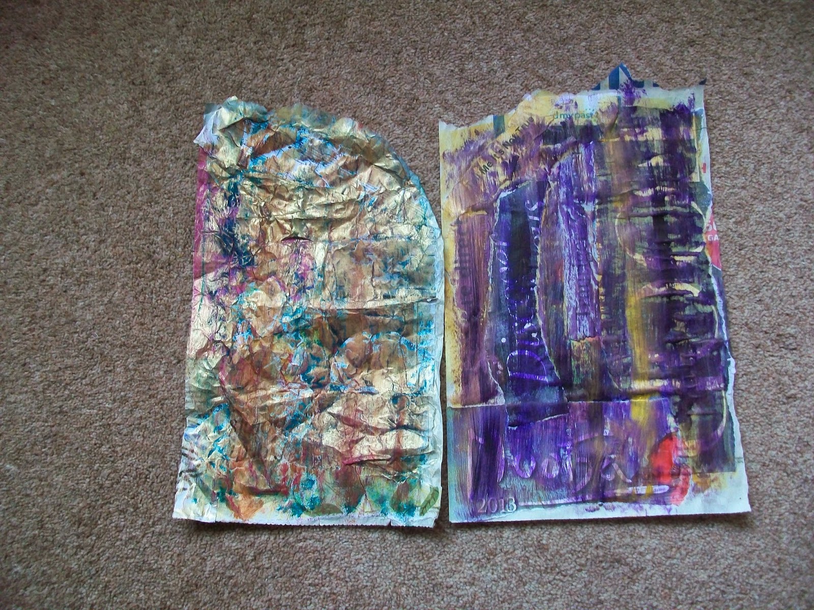
The one on the left originally had sponged paint on it.  I have scrunched the paper, painted it with gold and bronze and rubbed over it with a red inktense stick.  The one on the right was originally the 'headlines' page which I have just painted over with purple and gold.

Here I have cut off the drawing and stitched it to the other side of the page.  I have made the paint more bold with gold and black.  The one on the right was just overpainted with gold and stamped with bronze lettering - I couldn't bear to print over the hedgehog.


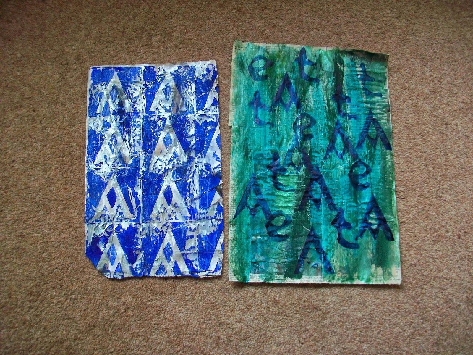
 The one on the left has been painted with silver (I was having a metalic day) and then printed with the negative letters.  It could have been a better blue, something darker like a navy but I was wary of mixing colours incase I ran out.  The one on the right has an acrylic paint background and I have used inks for printing. 

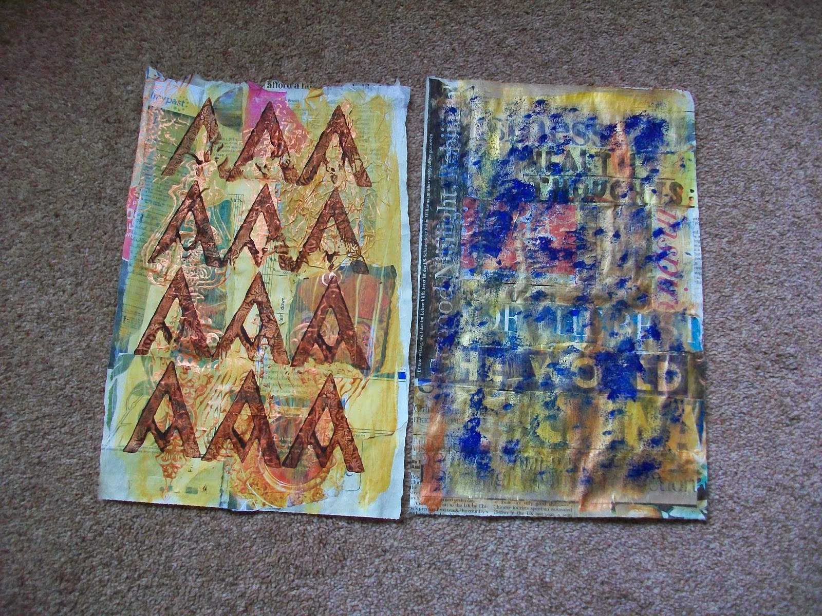
The one on the left was painted a yellow background so I used an indian type of stamp that I had and printed on it in bronze.  I then printed acrylic brown letters over the top.  This could make a really good piece especially where I have used tissue paper on the background.  The piece on the right was again large lettering which I have over painted in gold and then sponge painted in blue.

This was painted with a background of pink.  I printed positive and negative letters and did reverse images.  I then overprinted them with the positive stamp dipped in the paint I had used for the roller.  In between the prints I have used a small letter and white paint.
 
 This one had a background of turquoise paint which I have overpainted with green. I stamped it with blakc letters and then overpainted it with silver.

The one on the left had some shiny papers on it that didn't take paint well so I have used several metaclic acrylics on it and then printed a few silver letters on it.  The one on the right was painted bright green so I printed it with dark green and red letters.  I then overpainted with a deeper green and added a few more letters in gold.

This page in my sketchbook I have printed with bronze letters which I have outlined in black and then one large letter in black.

This page was painted turquoise and I have printed the letter 't' on it in various colours.  I think it looks like a shoal of fish in the sea.

Here I have given two pages in my sketchbook a wash of purple paint.  I have printed letters in gold and purple then closed the book to print on the opposite page.  I then added some more printing to the right had page in a pale apricot colour and again closed the book.  You have to work really fast to get the second print before the first is drying.  I like this better in the photograph that on the page.
 

Sunday, 21 September 2014

Module 2 Chapter 5

I am going to run these pictures together so that you can see the developement of some of the pages that either worked well or not, as the case may be. 

This is some of the recycled papers I collected.  While on holiday I managed to pick up a couple of free chinese newspapers and a german one from the airplane.


These are some of the general pages I made and coloured.  I like the sponged ones, the black one looks a bit like an animal print.


This was the first page I did.  I sat watching TV and tearing up paper and bundling it together ready to glue the next day.  However, I realised I was getting very specific, all these articles related war and battles but in 3 languages.  I needed to get more random so I stopped putting the paper into batches and just tore up loads of paper.


These are using headlines and large lettering.  Now I have put these two pictures together I realise that I could have done much more with these two.  I was too cautious not to hide the letters.


All the papers on this page have been scrunched up before gluing on.  I used gesso for the background and Koh-i-Noor paint.  I then rubbed over the top with an inktense block to highlight the creases.  I like this page and might just keep it to use as a book cover.


The picture is Robbie Williams.  I didn't really want to loose the face but again I have probably been too cautious and I could have done something over the top without loosing the image.


On this one I have used all the very small bits and scraps that I tore off the other scraps when trying to make them fit on pages.  I might get some good lettering on this one in the next chapter.


This is my plaited strips.  I might be able to do something interesting with this one too.


This one I am not going to paint, I think I will print straight onto it.  It is made from strips of card I cut off when making some tickets for a show in the village hall.


These are the ones I have stitched together.  The first is a grid using straight stitch and then I cut shapes out of some of the squares.  When I came to paint it, I had some numbers cut from bondaweb so I glued the backing to the page before painting it.  I thought there might have been more wax on the bodaweb backing to create a bit more of a resist.  The other two pieces I have just used a pre-set pattern and some free machining.


This is another one I am pleased with.  It is papers trapped between two sheets of tissue paper (the bottom one is a bit thicker than the top).  I don't think I gessoed it and I painted it with Koh-i-noor using a fairly course brush so that it tore through some of the paper.  When dry, I rubbed a light coat of Treasure Gold over the top.  The whole paper is completely changed, I then realised I had painted the other side to the one I had photographed first. I think I am loosing it!
 
 These pages are from my sketchbook.  First is just a straightforward gluing in strips of paper and painting it.


On this page I tore our 2/3rd of the page and stitched in some different pieces of paper.  In all these pages I have used either strong magazine paper orleft over bits of handmade paper.  The third page has thick thread couched down.


On this last page I used small pieces of paper, glued down but the thread from the previous page made boxes so I have cut through some of them to reveal the picture on page 2.


The painted versions of these pages.
 

 I looked at the work of Will Ashford and found this web site that gives his instructions on how to produce this picture.  I decided to have a go but using my own pictures.


The print and photograph of a liner are from a cruise brochure.  I looked at the words to see if I could make a sentence from them.  When I found some I outlined them I then traced the ship and placed it over the writing and coloured it in missing out any words I had outlined.  It should read from the top - One journey epic experiences sailing towards the water's edge and home.  I think I missed the word 'of' which should have been the second word and is right on the side of the ship.  An interesting technique though.  I like to try them out as they stay in the mind better that way.