Wednesday, 20 May 2015

Chapter 7 Drawing the Landscape

I looked online for drawings by Van Gogh and chose these two.

I like dthe smaller one best but wasn't sure if it was a bit too small to work with, so I settled for copying the larger picture.


I then decided to have a go at the smaller picture and was quite pleased with the way it came out.


I looked at the internet again for pictures by Hockney and Van Gogh.  I love David Hockney's pictures of the wolds.  I travel along these roads quite frequently and it is just like driving through one of his pictures.  I love the texture of Van Gogh's paintings, you just want to touch them.  I have also added two pictures by local artists who I think use line very well.  Ian Mitchell views of the Yorkshire coast are all done on the computer and are lovely and simple in their design.  Rebecca Vincent does Monotype and this one again reminds me of the wolds.  The trees are another Hockney which he has adjusted on the computer.


For my own painting I had chosen the tiny picture of a Tuscan landscape with cypress trees and farmhouse.  However, when I came to do the painting I had put the picture away in a safe place and couldn't find it so had to chose another one.  I was half way through painting that one when I found the first one.

I chose the larger picture as I particularly liked the colours.

I am not very good at painting pictures but I referred back to module 1 about painting the outlines straight onto the paper and not using pencil.  I made a small mark in the centre of the page to position the buildings.  I am reasonably pleased with my effort but I am not sure Van Gogh would approve.

Tuesday, 5 May 2015

Module 3 Chapter 6

Torn Papers

I started this chapter by making a small pile of torn papers using different types of paper, newspaper, brown paper, pre-painted paper, tissue paper and kitchen towel.

I then pasted these onto three pages of my sketchbook.


The first page I covered with a wash of watered down ink.  The second page I covered with a pearlescent ink that I hadn't watered down.  I was quite surprised to see the pattern on the tissue paper still showed through.  This would have been better thinned down.

For the third page I took your advice and tried writing ink.  The top of the page is undiluted and then I did the rest of the page with water added.  I really like this page, it has a mystery to it.

I made two viewfinders although I have used them before I could only find a very small frame one, I suspect I have accidentally cut the others up to make printing stamps.  I then chose some photographs and magazine pictures of landscapes.


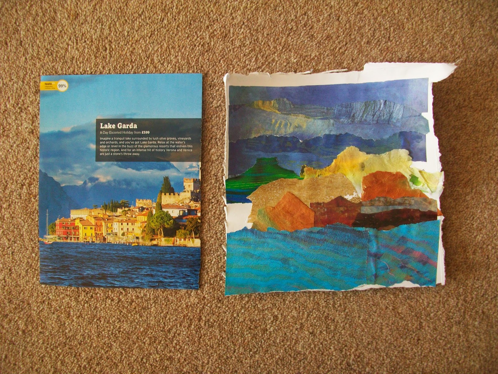
I chose a lovely view of Lake Garda to trace.

I then made a collage of it using mostly magazine papers.  I should have put the blue water under the buildings when I glued them down, then the white patch at the side would have disappeared and the perspective on the buildings would have been right.  I had all the pieces laid out at the side of my paper and I picked them up in the wrong order.

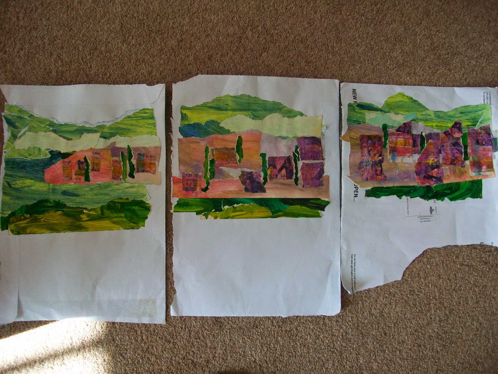
I then did a series of three pictures in which I changed the colours.  The piece on the right isn't quite the right size, it should have more buildings on it, or maybe the one in the middle should have fewer.  I wondered if I was put off by the size of my paper being smaller on the last piece - a good excuse.  I could also have varied the height of the buildings a bit more. I then tidied them up and put them in my sketchbook.


This was an interesting chapter, I haven't done much collage like this before and I was reasonably pleased with how they turned out.  They are a bit 'impressionistic' which takes me into the next chapter quite nicely.


Friday, 17 April 2015

Module 3 Chapter 5

Spaces make lines

Firstly I did some black squares which I cut into shapes and arranged to make a lines.  The first one shows a narrow line which gets wider then narrows again.  The second  makes a continuous zig zag line but at one of the points you have a choice of route, either continuing on the zig zag or finishing your journey.  The second set are circles, the first ones split to make a regular wavy line and the second set has differing shapes and widths to make an irregular line.


The third set are irregular shapes, again cut firstly to make a regular line and secondly to make an irregular line.  The next sets are coloured shapes.  Firstly colour on a black background and secondly coloured shapes on a coloured background.

Both the foreground and background of this piece are photographs of embroidered pieces cut out from an old magazine.  I liked these little stitched houses or beach huts and nine of them fitted nicely onto my page.  I cut each row of three differently to create different patterns and the middle row is stuck in upside down.  The houses aren't all exactly the same size and shape so this made little differences to each row.  I liked this piece when it was finished, I wasn't too sure while I was doing it.  It shows what you could do with pieces of work that don't work out as you would like.  You can give them a new lease of life by cutting them up and rearranging them.

Andy Goldsworthy.
Some of his work is amazing and I suspect on quite a huge scale.  I have picked these three pieces from what I found on the internet.  I loved the autumn leaves, very inspirational for embroidery.  I hope I remember I have got this picture as some later date.  The other two are sand prints, which living by the sea, I can relate to.

I started my extra activity with a bit of fun.  This line in my lawn has been made by next doors cats as they cross the grass to get out to the front of the houses.  It has been bisected by some shadows of canes.  Are they the new Andy Goldsworthy?


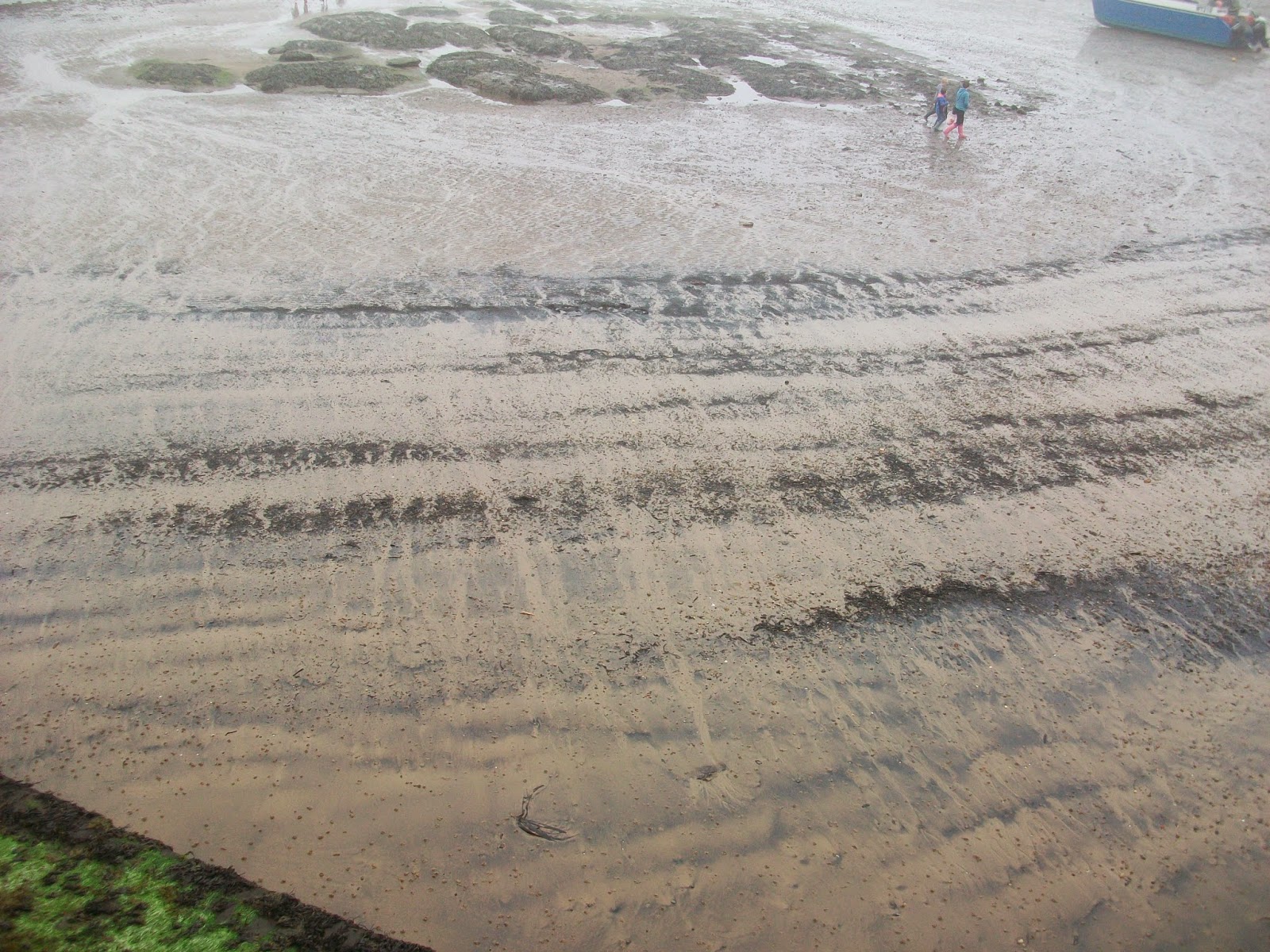
I thought it would be nice to take my daughter to areas of the coast and moors that she hasn't seen before or at least, not for a long time.  We set out Easter Monday up the coast to go and make lines in the sand with shells and seaweed.  As you can see from this picture, it was thick fog on the coast and a bit cold for playing on the sands.

I hope my subsequent pictures are OK as I have used lines that I have seen around me rather than making them myself.  So the next picture has been made by dogs on the beach.

The next has been made by tractor tyres in the sand and is reminiscent of one of Andy Goldsworthy's pictures I chose.  My photography isn't very good I'm afraid.

Here are some stacked lobster pots.  This was at Staithes.  There is a lovely pub right on the beach and the entrance door that faces the beach has a sign on saying 'In very high seas, please use other door'.  I wonder how many customers have ended up with salt water in their beer!

Ten minutes in land and the weather was beautiful.  This is on Blakey Ridge and the patterns are created by strip heather burning for the management of the grouse on the moors.

We had a lovely day out and both of us enjoyed using our eyes a lot more than we might have done and certainly more than those overtaking us at 60 miles an hour through this magnificent scenery.

Friday, 20 March 2015

Module 3 Chapter 4

Printed lines

This is my first page with the various tools I used to print.  I did acquire a few more over the time I spent doing the printing.
From now on I have mixed the two activities.  I was so busy printing away that I didn't realise I had done some of activity one and then some of activity two and then gone back to one.

On the left is printing as many prints as possible before recharging my stamp.  On the right I have printed curved lines.

Again this is printing as long as possible without recharging the stamp and again it is straight lines of stamps on the left and curved lines on the right.

This one is a bit pale but they are overlapping prints in wavy lines.

These are also overlapping prints.  The top one is with a single stamp the bottom one is with two different stamps and in a different colour.

Here I have introduced a second colour into the printing.  

The top one is random overlapping prints and the bottom one gradually get closer together and the line changes.


Here I introduced another colour.  The top picture shows the stamp picking up two colours.  The bottom picture I have changed the colour intermittently.


I missed this page earlier.  On the left are groups of overlapping prints and on the right I have introduced a second colour into the printing.
The top one is two colours overlapping and I quite like this one.  The second one is overlapping prints with a second print added in a different colour.

I went to a workshop to learn Batik.  I had never done it before so I used the printing techniques for my first piece just to get used to how to do the wax and this is the result.


I then did this piece which I do quite like and I am sure I can use but it demonstrates the use of printing a shape but in a different technique.


Friday, 13 March 2015

Module 3 Chapter 3

Kandinsky

I looked on Google images at pictures by Kandinsky but you have to be careful, not all of them are by him.  I was interested to see that not all the shapes are a single block of colour, some are shaded and some are mixed colours.  I chose these three pictures as representative of his work.


I particularly liked the one in the middle and based my own picture on that one.  However, before I started that one I spotted this picture and had to have a go at representing it . I think it looks like a little alien.


I got so far with my main picture and wasn't sure where to go next.  My daughter didn't think it needed anymore doing to it but I thought it did.  So I took your advice from an earlier module and I photographed what I had done so far.  I also photocopied it and worked on the copy.

This is the original

and this is the photocopy with the extra pieces added.  I am not convinced about the black half triangle at the top left, I thought the straight black line would link it all together but it isn't right, it's the only straight line in the picture and looks odd.

Making pictures like Kandinsky was harder than I expected.  Getting the balance right takes some thought but I enjoyed doing it just the same.  It was nice to look at his work again.

Monday, 2 March 2015

Mod 3 Chapter 2 - Creating Movement with line

This first exercise is done with a fineline pen number 8.


The first square is (allegedly) straight lines, the second is straight lines with variable spacing.  The third is wavy lines and the fourth is stepped lines.

The next two are done in 3B pencil and start with wavy lines either side of a central straight line.  I didn't think the first one had much of a wave to it so I did a second one which are more like bulges than waves.


The next four are done in charcoal.  The first page is zig zag lines and wavy lines.  The second page is  the same but using the side of the charcoal stick rather than the point.


The next set is done with pen and ink.  Firstly lines moving round solid discs and the second one is line moving round squares and rectangles.

I then decided to have a go and see what happened when you mixed the shapes.

I missed this page of waves and zig zag's.  All done with a staedtler fine pen.

Here I have used colour after looking at the Bridget Riley painting below.  I couldn't get the waviness right but I quite liked the patterns it created.  Done with coloured pencils.


This is Bridget Riley.  I have pasted the black and white design in on it's side as I find it a bit easier on the eye that way.

I chose these two pages of Victor Vasarely paintings.  I loved the face but my daughter hated it, she thought it was scary.


 These are my Paul Klee choices.  The first is called 'Exuberance' and it certainly has plenty of that.

I chose these pictures by Franz Marc.  The small one is of foxes and the larger one birds.   I love the colour in these.
This last one is my version of a Victor Vasarely.  I made a bit of a mess with the paint and I realised that the colour changes don't work when doing them straight across the page.  They have to be angled or curved to be able to make the changes.  Am reasonably happy with the result as I know where my mistakes are.