
You may recognise this from the photograph I posted earlier of the street of houses all painted different colours. I have posted it again further down.

This side is based on four buildings that I saw. I was going to extend the book to six pages but I thought that it might get repetative, especially the row of houses. All the colours are mixed from red, yellow, white and black acrylic. I have used papers I painted during this course and some I had from other sources. I have tried to use as many of the techniques I have done in this module.
I started by drawing some buildings in my sketchbook.

I am not very good at this and I knew straight away that this is not what I wanted to do. The row of buildings wasn't a problem, I had already decided to just paint strips of colour and then paint windows and arches onto them. I actually did this section last as I knew what I wanted to do, however, at some point I decided that it would be quicker to make stamps for the windows and arches and would demonstrate that technique. When you look at the photograph the windows don't all line up and although some of mine are not printed straight, etc. I think the effect is quite good.


The first picture on the reverse side is the start of the walk up to the church at San Luca. This is a 3 kilometer climb under a covered walkway. All the arches were commissioned in the 18th century and paid for by individuals from the town. Most had plaques on them and some would have been highly decorated.

Here I have used paper cut outs to make the arches.

The next page is the church of Santa Stephano.
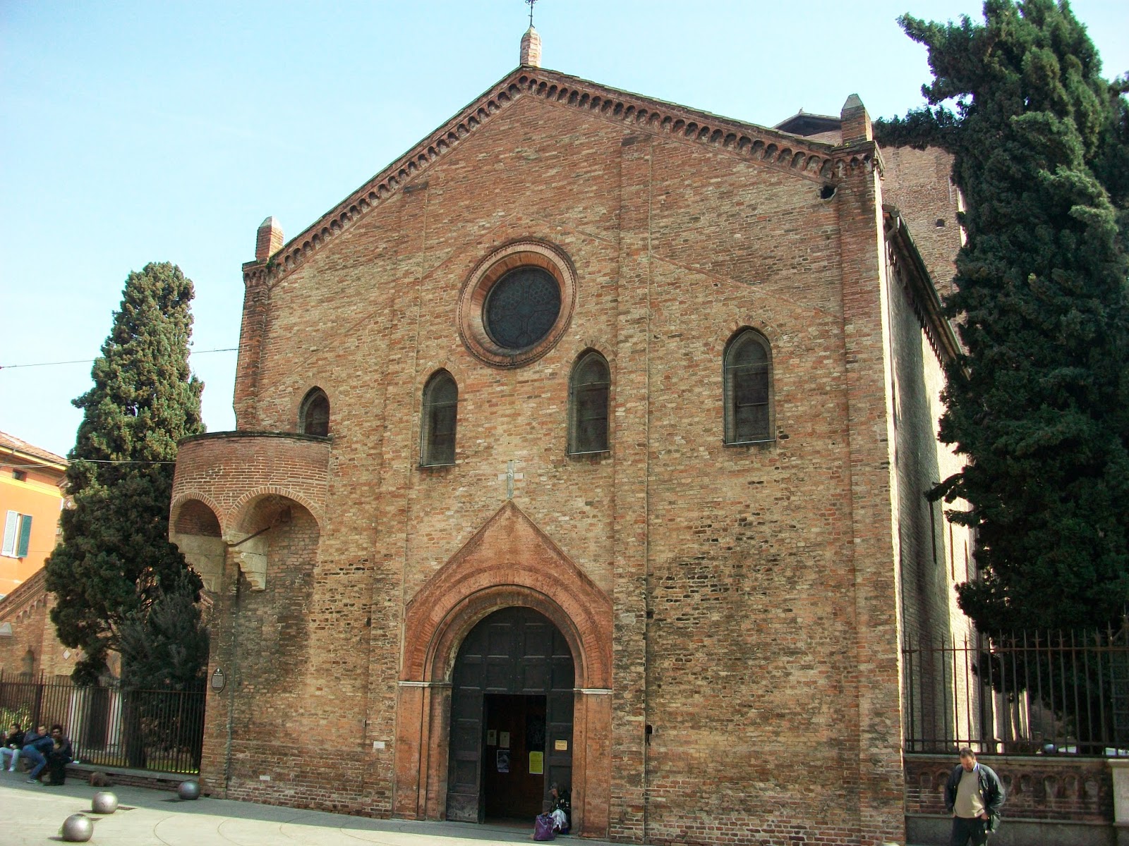
I thought this was a beautiful building. Unfortunately is was closed when we arrived so I don't know what the inside was like.
Here I used a picture of a wall I had cut out of a magazine. I put a section of it onto my page and then matched the colours and the bricks to finish off the background. I then cut the door and arch and the round window from painted papers and pictures of embroideries I had found in another magazine.


Again I have used papers I had already painted. These were acrylic glass paintings that I had done some years ago for another project and it just shows, you should always keep the scraps as they do come in useful.

The last photograph was of the outside of the walkway to San Luca as it curved round the first bend.


Finally, I added a strip of paper painted brown to tidy the top edge and look like a roof to all my buildings.
I hope you like this and that I have fulfilled the project. I feel it is more a celebration of a town rather than a colour but all the colours are shades and tints of orange so I think it works.
I am impressed. You are certainly finding your artistic side to complement your stitching talents.
ReplyDelete