Friday, 10 March 2017

Module 5 Chapter 9

Crowds.

Choosing pictures of crowds proved more difficult than I expected, I thought there would be loads in the newspapers and weekend suppliments but there wasn't.  However, I did manage to put these together without having to go onto the internet.


Top left is from my daughters university magazine which shows a picture taken in what looks like the 1950's.  She thinks it represents taking the chancellor to the university on the first day of the new year.  They don't look too happy about it.  Top right shows what happens to the crowd in the background when the focus is on the foreground.  All the faces in the crowd become a series of dots. Bottom left is a bit small but shows photographers at an award ceremony all facing right trying to get a shot of the new entrant on the catwalk.  The centre shows ice skaters on Central Park and looks so much like a Lowery I just had to put it in.  Bottom right is a street scene and I have forgotten where it is but it is evening and people are obviously out to enjoy themselves.

I then went looking for shapes that I could use as stencils and stamps.


I found these on the internet.  They are clear and sharp and easy to trace.


I enlarged some of them using Paint Shop Pro and then cut them out.

This gave me paper shapes that I could use to make arrangements on my paper.


I made a set of stamps then made a second set keeping the cut outs for stencils.


Drawing round the shapes with different coloured was crayons.


This paper was quite dark so I drew the outline in white pencil crayon.  I wondered what they would be like shaded in so I took a photocopy and using the white crayon I did various shading techniques for each figure.


I then tried my stencils.  I liked this one, it reminded me of people on the street at night in front of a lit shop window.

Here, I have made the figures two colours and then mixed the solid shapes with the outline ones.


These are collaged.  The light ones are glittery paper and the dark ones are printed tissue paper which I did on a course a couple of years ago.


I drew round all these figures with a gold pen first but they didn't stand out until  the light caught the gold so I then edged them in black felt tip which gave the gold a lift.  I then cut out thee of the figures in painted paper and made them slightly smaller than the drawings, trimming them where other figures overlapped.  I liked this idea and the stripey paper went well.

This is repeating the technique from the Keith Haring work.  I cut the figures out from one page of a magazine that had several individual picture on it.  I angled the shapes so that the white lines were not straight on the figures.  Putting them together in this way, the white lines make some interesting shapes.
I then went onto monoprinting.


Here I placed these shapes inside a plastic wallet, I then painted the wallet, following the shapes.  I put all the paint on before printing because I was unsure whether I could line the figures up each time.  I'm actually quite pleased with this one, I think all the figures have terrific movement.
I then tried printing each figure in turn.  Again, they turned out better than I expected, some of them look as though they are pictures of all the muscles in the body.  This will have been created by the paintbrush I used to put the paint on with.


This was painting up a plastic sheet and drawing into it.  I used a piece of paper that I had laminated first and it makes a good surface.  However, I have got too much paint on here.  I am very unsure about trying to draw quickly into to the paint especially if it is supposed to represent something specific. So this first print was not successful. I used the end of a paintbrush to draw with.

I did another pull as the drawing was still in the paint and this one is slightly better.  Don't think I would use this technique very often unless the drawing was abstract.


This time I inked up the plastic and placed a sheet of paper over it and drew on the back of the paper with an old pen trying not to lean on the paper.  I was pleasantly suprised with this one, it came out better than I expected.
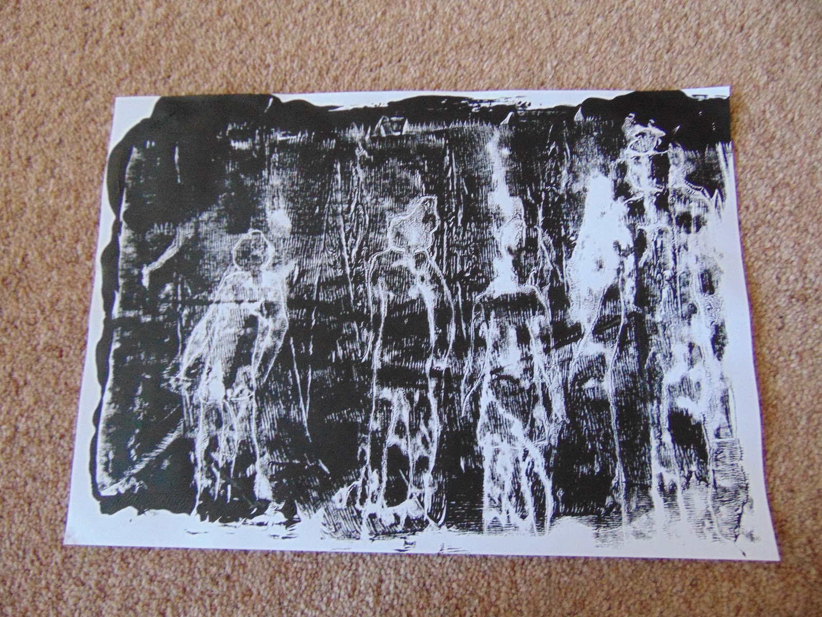
Because the drawing was still in the paint, I pulled another print.

Then I tried a third print.  Not quite so successful but useable in the right place.


I then got my gelly plate out.  Firstly I painted the plate and then put a piece of netting from a fruit bag over the paint.  I printed the paper with this, removed it and the netting.  I placed the paper cut out figures on the plate and ran some more paint over everything. I then printed the paper again.  I did two prints like this.


Here I place the paper shapes on the gelly plate and then painted the whole plate and took a print on paper that had already been painted.

The left hand print is a second print of the one above but on white paper.  The right hand print I added more paint to the plate then added the netting and took a print.


These are my paper shapes after I removed them from the gelly plate.  Unfortunately the man lost his head but the rest are going onto the cover of my sketchbook.

I wrote all the details on the back of each print and I have then stapled them together in their different techniques and they are now all in my folder.

I was a bit nervous about drawing crowds but the shapes I found made it much easier for me to manage.  I quite like printing, especially onto fabric but you need to have really planned it out first to make sure that your ideas will work.  Doing the prints on paper first will be a big help and I shall do that in future.


Sunday, 12 February 2017

Module 5 Chapter 8

Search for Lowry Pictures 5.8.1

I love Lowry paintings and have been to the gallery at Salford several times.  There is so much movement in each painting and lots of interaction between the figures.  Below are the ones I chose from google images.


The bottom left is a waiting room at a Hospital Outpatients clinic somewhere near Bradford and it is almost identical to the one at Scarborough Hospital 35 years ago when I used to go for pre-natal check ups.  The seats were individual chairs arranged across the room, on the right was a hatch where you made return appointments and on the left side and in front of you were the doctors rooms. I just had to print this one.

From these pictures I chose the following figures to draw.

The man laid down is from my morning coffee mug and he is laying on a wall smoking a cigarette.


These are my modern day 'Lowries'.  I found it difficult to make them as small as the others because I wasn't copying them and didn't have the scale to follow.

Keith Haring. 5.8.2

  Again I used Google Images to find some of his work and chose these few.


Here I copied some of the figures from the pictures above.


This is my set of cardboard shapes traced onto white paper which I have then coloured with a watercolour paint and then painted the figures with Inktense paints.


When I turned the page the ink from the felt tip outlines had seeped through in places leaving some feint outlines.  I didn't want to waste them so I have covered them in pale pearlescent watercolours using wavy lines both across and down.  I finished this with the black border to put a finish on the lines going across.


Here I have used a piece of black card with cut out white figures and one red figure in the middle.  There was no need to outline the shapes but I did have to mark in the heads, legs and arms where necessary.  I liked this one and the choice of shape for the red figure I felt was just right and I didn't use it again.


This last one is shapes cut from a magazine in various colours and I have overlapped them to form a complex arrangement.  I made this by gluing down two or three shapes then marking in the outlines before adding another layer.  If I hadn't done it this way I think it would have got very difficult to work out where all the arms and legs were.  As I cut out each shape I placed it on the paper background and the arrangement was great but you can never quit recreate it when you have to take it apart to put the glue on.  This arrangement is fine but not quite as good as the original.

A good exercise this,  I enjoyed looking for the pictures and found Lowry more difficult to paint than I realised.  Keith Haring is so completely different, his figures have so much movement and can be arranged at any angle whereas Lowry figures have to be placed in context with their background.


Sunday, 15 January 2017

Module 5 Chapter 7

Bodies and Movement

I started by dividing my sketchbook page into eighths and then drew in the sections of the body as shown in the coursework instructions.


I then made an articulated body using card and split pins.  The first one did not last very long, his arm and leg fell off but the second one was much more robust, not sure why, they were both made from the same pattern and same piece of card.


I then started to draw with them, still using my sketchbook.  I hope you can see these, they are very feint.  First I did single figures.


Then I went on to do several figures on each page.


I then did more groups but coloured them in.

These figures are coloured in pearlised water colour with Koh-i-Nor background.


This took a lot of working out and the effect is not quite as bold as I thought it might be.  I refered back to Module 1 and the patterns I did then.

I photographed these and then loaded them onto the computer and took the first of these two photographs and cropped it to enlarge the picture.  I then started changing the colours and textures.  I attempted to do this with the second picture but it meant clicking on every square to change the colour.


The cropped picture


Colour change.  This didn't completely change the colours as there must have been some breaks in the connecting pixels.


Here I have put a chequered background to the figures.


Then I put a venetian blind effect over the top.


This is a polished stone effect which has changed the colour of the yellow.


This was a shaded blued effect which went over all the picture except for the one black leg which I left as I thought it stood out so much.

I then tried the second picture using distortion tools instead of colour changes.


So here is my original which I have cropped.


This is the kaleidoscope tool.


This is a wavy edge tool.

This is curlicule. I liked this one.

I then did a couple of pictures using cut out models.


When I found these two papers in my box I thought they might look like people at a gym class in their lycra outfits so that is how I place them.  Afterwards, I looked and thought that they are more like groups of two people fighting.


The background to this is a photograph I took at Yellowstone Park where the trees are defoliated and killed off by the acids in the ground.  I thought it looked a bit like a WW1 landscape.  The men are cut from a book 'Testament of Youth' which is set in WW1.  The yellowed pages did not stand out against the background so I gave them a light wash of red watercolour.  I hadn't deliberately cut them out to make this row but when I started to move them about I realised that this was a good arrangement.  They could be men falling in battle.

I enjoyed this more than I expected.  It was interesting how colour made the figures come to life.  It was also interesting to see how you could make the figures interact with each other.  It's funny how you give the shapes a gender - the purple gym figures were female - but when you place them together, their body language can change that perception. My purple ladies became men because they appeared to be fighting.

Sunday, 4 December 2016

Module 5 Chapter 6

Changing Faces

I was interested in this chapter as I had done some work last year on Maori's and the facial art that they use.  I went and dug out my workbook and enjoyed re-visiting it and the embroidery I produced at the end I was very pleased with.


Two of the pages from my workbook.
The finished article that now hangs on my dining room wall scaring all my guests.  He does have hair but you can't see it in this photograph.

This time, rather than look at painting the face I thought I would look at covering it with masks.  I made some notes in my sketchbook and decided to look at Venetian Carnival masks.  The women's mask are all a similar basic shape but with lots of decoration but the mens have more interesting shapes so I decided to look at those.


These are my notes

Some basic sketches of the masks I found on the internet.

The shapes fell into four catagories.  Half face masks, eye masks, long nosed masks and long chin masks.  Some combined the last two.

Popular colours are what they call 'Columbina' which is cream, red and blue in a diamond shaped pattern named after the puppets and plays of the past.

I decided that the long nose shape was probably the best to work with so I started with the shape and colouring it in different ways.
The half masks colour up lovely and decorate well but they are more difficult to make a stencil that has a recognisable shape.  So firstly I made a stencil and I bought a Gelli plate at the Knitting and Stitching Show so this was my first attempt.  The centre was blank, I had used too much paint but when I had finished with the stencil, I pasted it in the blank space and it looks fine.


On these prints I have pulled a second print from the first plate with a background that looks more like old leather now.  On the page along side it is a faded brown print which I cut out and put into the centre of the brown print and it looks quite good.  The green print stencil has come out grey and I couldn't work out why until I realised I had painted the wrong side of the stencil and the grey cardboard had pulled off onto my print.  I have tried to remove it but it is stuck and doesn't look too bad.
These prints didn't work too well although the one on the left looks a bit ghoulish.


This is the leather look after I had stuck the print into the middle.

All these prints are now in my sketchbook.  As the stencil was getting a bit soggy I decided to make a stamp and do some printing.  I went back to Module 2 and made some papers up from newspaper and various other strips stuck to it.  It takes a lot longer to do in winter as you have to wait so long for everything to dry but patience was rewarded and I ended up with this pile of printed papers.


From these, using another basic stencil, I cut out a shape from each piece of paper.  I wanted to make them look like a mask on a face but I didn't quite know how best to draw a male face.  I then had the bright idea of using a simple skull shape. I drew the shapes onto white paper then glued the masks to them.  I was quite pleased with the result but decided they would look better with a black background so I cut them out and stuck them on card and this is the result.


The one on the left is overprinted with an indian style stamp while the middle one is underprinted with it.  The right one, I painted the stamp with the three 'Columbina' colours.

The left is a Gelli print where I have drawn into the paint, the right has a Gelli print background of a fruit bag and the middle one is overprinted with a small Indian style stamp.


The left one has emulsion paint background, the middle one does not have gesso and is printed straight onto the papers.  The right one is underprinted with a circular lino print.
The right one is just red and black prints.  The one on the left is a piece of lutradur which has been printed with expandaprint through a thermofax screen, zapped with a heat gun then foiled on top.  This was done at a workshop with Lynda Monk and I thought it worked well for this exercise.


After cutting the shapes out of selected areas, I was left with papers that were uneven in size so I trimmed them all down and these will go into my folder along with my masks.

The very last trimmings I have tided up and put into my sketchbook.


I loved doing this chapter.  Once I got started I didn't refer to my course work until I had finished and then I suddenly thought that I should have checked that I was doing what was required. This to me is what a sketchbook/workbook is for and it is lovely to refer to in the future.  I enjoyed looking back at module 2 and getting that sketchbook out again. I have some bits of brightly dyed fabric that this print would work on and I just might have a go in the New Year.