Wednesday, 21 October 2015

Module 4 Chapters 1 & 2

I have put together chapters one and two because I found it easier to work on one drawing and carrying straight on to put the detail in.
I started with this drawing of a goldfinch which is in the book I am planning to alter.

I drew the bird and then I drew this broken fence which is also in the book but as I was at the art club at the time I didn't photocopy it in black and white.
I wasn't too happy with my pictures and I felt a bit constrained with the size of the drawing I was having to produce due to the squares.  So I drew larger squares on the next page.


This was better but then I found another picture of a goldfinch in my bird book.
I thought this was a clearer picture so I copied it and drew it, this time properly following the instructions in the course which was to just do an outline.


I was pleased with this and drew it again this time putting in all the shading.


Feeling more confident with the larger squares on the paper, I then went back to the fence.


This was my outline drawing, hope you can see it OK.


Then I went on to do the shading.  I have done all these seperately so I still have the original drawings to go back to.

I then got a bit over confident and tried to do a building.  I love buildings but have real difficulty with the perspective of them.  I chose this painting of a church.

Done on the smaller squares, this doesn't look quite right, I've got too much curve on the left wall and somehow the whole thing looks fatter but it doesn't take up anymore room on the grid than the original.

As I thought I could work better drawing larger, I did this again with larger squares but the result isn't any better, I had real trouble fitting it into the squares.  I might give up on buildings and stick to fences.

I thought I had better try out a flower as they may be included in my book.

I did this first attempt on smaller squares in the corner of a page.  I forgot the butterfly somehow otherwise it wasn't too bad.

This is a larger outline, again not too bad.

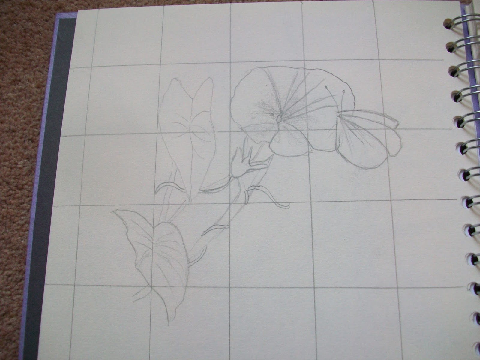
Not so pleased with this one.  I tried to do the background with hatching but it is a bit heavy for the picture.  Also, I haven't got the inward curve of the petals on the flower.  I tried using the rubber to create the white lines in the picture but it didn't really show up so I think that is where I lost my curve.

These drawings are quite good for me.  I have never considered my self as a person who can draw.  I am quite pleased with the goldfinch and the fence.  Interestingly these two were drawn sitting at a table at the art club and the others were drawn sitting on the settee at home, so maybe my position wasn't as good as it should be.

Wednesday, 12 August 2015

Module 3 Chapter 10

Looking at David Hockney and Friedensreich Hundertwasser


I chose the lower of David Hockney's paintings because it is one I didn't know and I liked the colours, they are a bit different for him.  The top one is well known and the perspective just makes you want to walk that track.
I hadn't heard of Hundertwasser and was amazed at his buildings.  When I first looked I wasn't sure if they were real buildings or just paintings so I had to choose one for my book.  The lower painting is a cityscape and reminds me of Klimt with all the little blocks of pattern.

Creating a customised sketchbook.

I must have had an interest in geology even when I was quite young as I have a very old Observers Book of Geology which I know I bought for myself.  I recently visited the Rotunda Museum in Scarborough which is entirely devoted to geology and I bought a book about the Yorkshire coastline, known as the Dinosaur Coast (I think you have one down in the south west as well).  I decided to make my own book about the dinosaur coast to cement my knowledge and hopefully file it in my brain where I can find it again some day.

All the paper is painted wallpaper lining paper, and I chose to do a stab stitch book as I wasn't sure how many pages I was going to do and I could easily do them in any order.

I started with my two books and an old atlas by the Readers Digest that has a lot of information about the earth.


At a recent paper making workshop, I made two pieces of paper with Kozo fibres embedded in them and I thought one of them looked a bit like a dinosaur footprint so I used that for my front cover.


My first page is showing the ages of the earth with an extending paper attached at the top.  The extension is machined on at the bottom of the page to look like black lines.


The next two pages are flaps.  The left hand side is a set of little maps showing where the various mining industries were sited as well as the Lower Jurassic rock and the plant fossil beds are.  The two ichthyosaurs are glued at the tail and can be lifted to see the plesiosaurs underneath.  All the flaps are glued in.


The next two pages are about Whitby.  The extended page is stitched in and unfolds in two movements.  The first is to demonstrate the difference in height of the two cliffs and the second is to show the opening between the two where the river Esk flows out to see and the ships sail into the harbour. Hopefully you can see my ship.


The next two pages are Robin Hood's Bay and Ravenscar.  The photograph just folds out to show the bay and the painted page has been cut into a circular shape to enhance how the bay has been formed.


The next double page takes us to the Middle Jurassic period and the Jurassic jungle. I have used the reverse of the circular page to paint the jungle on.


The next double page is still at Ravenscar and the Peak Fault.  This explains how the land has split in two at the headland forming an outcrop of Jurassic sandstone about 500 metres long.  I have demonstrated this with and extra point of paper glued in after the book was stitched together.  It needs a little help to pop out when you turn the page.


We now move on to Scarborough and a photograph of the town folded in to fit the page.  On the second page is an added flap to show how the cliff has formed.  This was also glued in.


The next two pages move on to the Upper Jurassic period and Filey Bay.  This shows how oil reservoirs are formed and when you lift the flap you have a picture of a rig.


The last double page is a painted map of the rocks and landscape of the area and was done seperately and glued in when the book was finished. The bottom folds up to fit the book.


On the back page is my bibliography and the back cover is the other piece of hand made paper.


I hope this is what was required for the course.  I know it wasn't a topic from design sources as such and I have used other publications to provide my information but the line drawings seemed to fit so well into extended pages and I have enjoyed doing it. I feel a child might enjoy looking and playing with this book.

Wednesday, 8 July 2015

Summer School

I thought I would share some of the work I did with Sarah Burgess at this year's summer school, particularly as it was focused on 'line'.

We had to bring some pictures/photographs of landscapes that we particularly liked and among mine was this one of the Athabasca trail in Canada.  The First Nation Canadians walked this trail along the river from their summer camps to their winter camps and it is a very atmospheric place, although the photographs don't do it justice.
We then had to make a stitch print from which we did lots of mono printing. Unfortunately the window frame has cast a shadow over my work.


I particularly liked these prints and thought that they followed the path a river might make.


I worked on these pieces using wire to follow the pattern.  I thought that they might represent pathways throughout ones life.  The 3d piece is the feeling of going round in a circle, the yellow one with the split wires is where you have to choose a pathway and represents the road not taken.  The orange one has a dark beginning where your life is out of control but you make the change and the pathway becomes smoother and brighter.  The black one is life itself from small tight changes in childhood to bigger more varied changes during middle life and gradually smoothing out in later life.

The next day we printed onto long strips of fabric using different printing equipment if we wanted to.  These are my favourite pieces and ones which I hope to work on later.

These were some more of the first days work that I particularly liked and have worked into.

Tuesday, 16 June 2015

Module 3 chapter 9

Extending the page.

I was sitting at my daughters one evening with nothing to do so I decided to make a start on this chapter.  I had been reading a very tatty copy of 'Testament of Youth' which I had got from a charity stall and as it wasn't in any state to pass on again, I tore out three pages and with some scrounged sewing thread from my daughter I joined them together.  Of course, you can't read them now as they don't follow on but I quite liked the effect and it is something to remember for the future.

In view of the content of the book the flowers are meant to be poppies and the black lines are barbed wire.

As I only have one page left in my sketchbook, I decided to make one long piece of work which I will add into the book when I have finished all the writing and notes I want to do.

The first half reads as follows:
Staples in a zig zag pattern.
Running stitch in cotton pearle.
French knots in cotton pearle
Plain machine stitching
Punched holes fastened with bows of cotton pearle
Safety pins
Machine stitched pattern

The second half starts with:
Large single stitches in cotton pearle
A plain seam done in back stitch with cotton pearle
Large cross stitches in cotton pearle
Fine wire with beads threaded on
Three strands of mixed threads stitched through punched holes
Small cross stitches in a polyester thread


All joined together I thought this made an interesting piece.

I don't have much in the way of metal fastenings or trimmings so I hope the use of stitching is OK.
The papers I have used vary from magazine to hand made, kitchen towel, paper bags, wrapping paper, newspaper and pleated tissue paper to make it strong enough to hold the stitches.
You have to be careful when joining pages together to make sure that it is right for both sides of the page, which is where I start for the next chapter.


Thursday, 4 June 2015

Module 3 Chapter 8

String Prints

We have a large number of maps of varying sorts in the house, partly because I used to subscribe to National Geographic who include maps in their magazines on a regular basis.

The 'Cartographies' is from a museum in Palma, Majorca where there was a fantastic exhibition of old maps. The one to the left of it is called the 'Bawden' map of Scarborough.  It has recently been restored and is on display in the library.

The photography of Yann Arthus Bertrand is fantastic.  I had to choose the first picture of the Hiram Bingham Road at Machu Pichu as I think I have been up and down that road in a coach!

I have used both an ordnance survey map and a street map to make my drawings.

By doing this, you can see clearly how the streets are straighter and in a more rigid format than the country roads in Cumbria.
These are my string prints.  The one on the left is from the map and the one on the right is my own design.

Next are my rubbings done on the blocks.
This is wax crayon with a wash of Koh i Noor on computer paper.  All the prints had washes of Koh i Noor. I have used both stamps here

This is Markel stick on hand made paper.  The paper soaked up the paint and although the Markel stick shows through, it doesn't have the same look as a resist.

 This was two colours of Markel stick without a wash. Overprinted with both stamps.

Both these are Markel stick, one on recyled envelope and the other on brown paper.  I like the brown paper one.  The colour wash ran down the paper and stopped at the edge of the resist.

Printing with the blocks.
Block one on its own and seperated prints.

Block one overlapped.

Block one overlapped and printed randomly. I particularly like the top one.

Block one and block 2 printed together

I think this is block one and two overprinted.  I keep forgetting to write on the back what I have done.

This again is both blocks printed randomly.

I was quite suprised how good the prints were.  The first block taken from the map really made a good repeat pattern.  When time permits I might take this exercise further and try it on fabric, especially some of the new man made ones that can be distressed easily.