Friday, 27 June 2014

Module 2, Chapter 1

I can't believe it's over a month since I last posted on my blog.  I have been delayed because I have found it difficult to do the outside photography.  I either forgot my camera or forgot I had brought it with the intention of taking photos.

Activity 2.1.1.  Fonts

I have only used the fonts on my computer.  I am a bit wary of downloading things now since my computer was hacked into last year.  However, I think that there is a reasonable variety on Word and these are some of them.

 
These two are just a selection of fonts on white copy paper and the back of a brown envelope


Here I have printed in red on newspaper, it reminded me of the joke 'what is black and white and red(read) all over?   I often use the Word Art option in Word when making posters and tickets, it can be quite effective but I can't work out how to change the colours.


The one on the left is on mulberry paper, the single red letter gives a medieval feel. The printing at the bottom is where I put it through the printer but it jammed so I turned it round and tried again. The one on the right is a thick tissue paper with a logo on it.  I particularly liked this one and have put it in my sketchbook.  I have printed in a pale blue first and then a darker blue over the top.
 
The one on the left is on sugar paper and the one on the right is a piece of my own painted paper from Module 1.  That one used a lot of ink, I had to leave it to dry for quite a while.
 
 
Activity 2.1.2  Topsy Turvy Printing


My brain had a bit of a problem with turning the paper upside down to put it back through the printer.  The one at the front is just lettering printed over the top of each other with a colour wash painted on afterwards.  The top left is also printed one over the top of the other but here I have used a very pale blue for the background print and a black on the top.  The colour wash is two shade of blue and then a pearlised paint on the top.  I do quite like this one and will put it in my sketchbook.  The one on the right I managed to do properly and turn it upside down.  I might have another go at this technique as I think the choice of fonts will make all the difference.
 
Activity 2.1.3  Collecting words for inspiration.
 
I am a bit short of items here.  I had some advertisements in mind but they haven't been in my newspaper magazine recently and as I explained, I am a bit lax with my camera but here is what I have got.
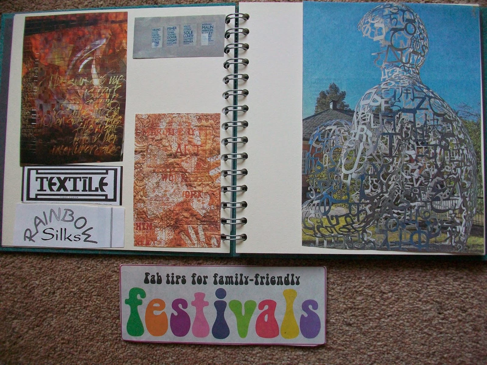


 These have been cut from magazines.  The two colourful ones on the left page are embroideries from an old embroidery magazine, the top right of that page is four placques with the fishing regions printed on it.  The piece of artwork on the right hand page was in a newspaper and I was so excited about it, I cut it out without the information as to where it is.
 
I haven't printed these off yet as I thought I might try and get some more.  I know a men's barber shop in town that has a wonderful font for his sign but it is difficult to get to when you are in the car.


This car belongs to my daughters neighbour.  It uses letters and numbers but also different shapes to make the letters.

I was in Cambridge and did take the camera.  This is joining letters together and also fitting letters inside each other (the Land the I) to make a tighter image.  It also uses letters of differing sizes.
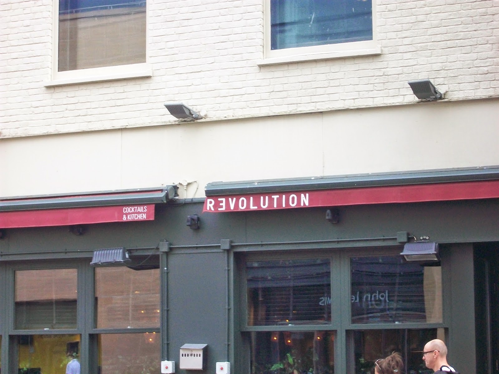
 
Using a letter the wrong way round.

Using letters of different sizes and an interesting font.
 
Activity 2.1.4  Collection of recyled papers


This is some of my paper collection.

Wednesday, 21 May 2014

Chapter 10 - a Folding book based on a colour of your choice.

I had been planning for some time to do my folding book based on the colour orange.  I had a list of things I could put into it, some might have been a challenge to source but I wasn't daunted.  Then I went to Bologna and was completely bowled over by the architecture and the fact that most of the buildings were painted in a shade of orange.  So here is my folding book based on Bologna.


You may recognise this from the photograph I posted earlier of the street of houses all painted different colours.  I have posted it again further down.


This side is based on four buildings that I saw.  I was going to extend the book to six pages but I thought that it might get repetative, especially the row of houses.  All the colours are mixed from red, yellow, white and black acrylic.  I have used papers I painted during this course and some I had from other sources.  I have tried to use as many of the techniques I have done in this module.

I started by drawing some buildings in my sketchbook.


I am not very good at this and I knew straight away that this is not what I wanted to do.  The row of buildings wasn't a problem, I had already decided to just paint strips of colour and then paint windows and arches onto them.  I actually did this section last as I knew what I wanted to do, however, at some point I decided that it would be quicker to make stamps for the windows and arches and would demonstrate that technique.  When you look at the photograph the windows don't all line up and although some of mine are not printed straight, etc.  I think the effect is quite good.


The first picture on the reverse side is the start of the walk up to the church at San Luca.  This is a 3 kilometer climb under a covered walkway.  All the arches were commissioned in the 18th century and paid for by individuals from the town.  Most had plaques on them and some would have been highly decorated.

Here I have used paper cut outs to make the arches.


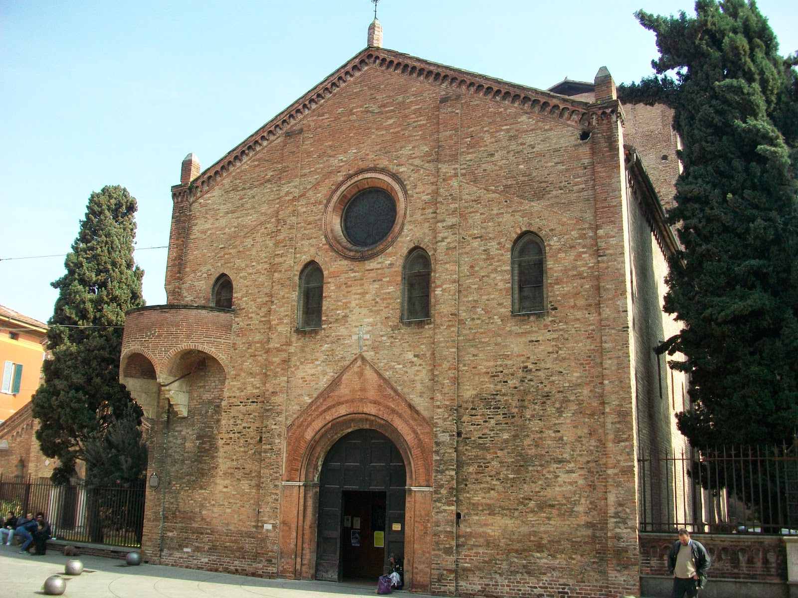
The next page is the church of Santa Stephano. 


I thought this was a beautiful building.  Unfortunately is was closed when we arrived so I don't know what the inside was like.

Here I used a picture of a wall I had cut out of a magazine.  I put a section of it onto my page and then matched the colours and the bricks to finish off the background.  I then cut the door and arch and the round window from painted papers and pictures of embroideries I had found in another magazine.


This photograph was of an archway I spotted while walking throught the Mediaeval Museum.  It didn't appear to have any purpose and actually looked as though they had just found it while doing other renovations.  I loved the mixture of patterns and the rough brickwork.


Again I have used papers I had already painted.  These were acrylic glass paintings that I had done some years ago for another project and it just shows, you should always keep the scraps as they do come in useful.


The last photograph was of the outside of the walkway to San Luca as it curved round the first bend.


 I wasn't sure about this one.  I painted the page to match the first page, using acrylic paint and cling film.  However, I think I must have done the first page with Koh i Noor paints (always label) as the texture was different.  This meant that my first cut out didn't look quite right, it was too pale, so I painted up another sheet of paper and made it a bit more pinky.  Only a slight change in colour but I think it made a difference.


 Finally, I added a strip of paper painted brown to tidy the top edge and look like a roof to all my buildings.

I hope you like this and that I have fulfilled the project.  I feel it is more a celebration of a town rather than a colour but all the colours are shades and tints of orange so I think it works.

Friday, 2 May 2014

Chapters 8 & 9

Before I started Chapter 8 I realised I hadn't done any prints in my sketchbook so I did a couple.  I know now why not to do them straight in.  Firstly, all the previous pages creates an uneven surface for printing and secondly, the wire spine gets in the way, however, these are my attempts.

Both are Koh i Noor backgrounds with acrylic prints.  The bright colours have changed depending on the background colour whereas the more subtle and metalic colours haven't.  I like both of them though.

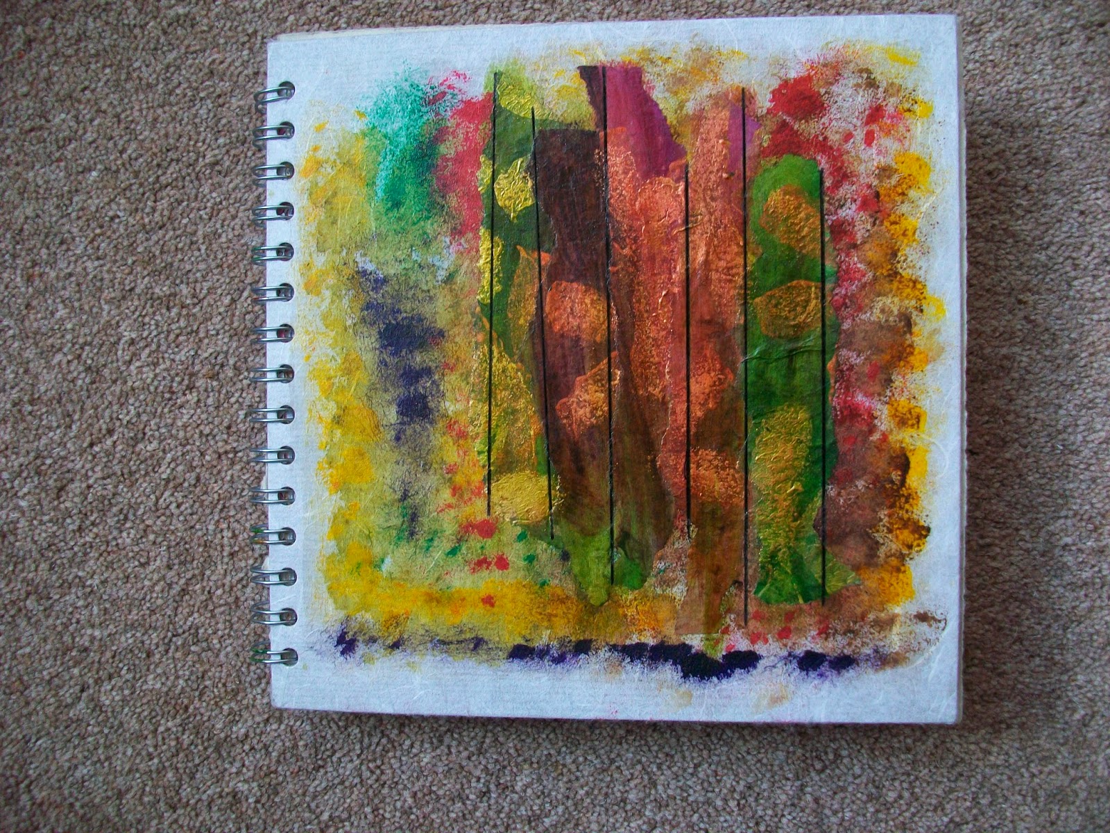
I then decorated my sketchbook cover.


I sponge painted the background with acrylics.  Then I added torn strips of one of my printed papers.  These blended in a bit too much so I, highlighted the metalic prints with treasure gold then painted the whole cover with acrylic wax and then used alcohol inks over the paper in green and cranberry to enhance the papers.  I had accidently laid some black cotton perle over the cover and I decided I liked the effect so I drew the black lines down in felt tip pen.  I thought it almost looked like human shapes behind bars (or was that the wine talking to me).

Now to chapter 8.  I borrowed a book from the library on Matisse and I have to say I liked his earlier still lifes best.  I prefer the rustic colours.  I did choose one off the internet as well which was more colourful but still a simple arrangement.


Now came the difficult bit.  I set up a still life, photographed it, traced it into my sketchbook then painted it.  I used acrylics again as I have been learning a lot about how to use them in this module.


This was my still life.  I had put a board behind it to make the background a bit easier but it kept falling off the table so I just simplified the sideboard.

I didn't get the napkin right and I think this was partly because I took the photograph at a slightly different angle to where I was when I was painting so my lines weren't in the right place.  I don't think I would eat that pear.


This is the still life I set up for myself to paint directly into my sketchbook.


I painted it in using a blue watercolour.  Although I know there are a number of mistakes in this I have to say I am really pleased with it.  The pictures I have painted in this sketchbook must be some of the first I have done since leaving school and I'm not saying how long ago that was!  I can see that I have missed the knife blade near the wine bottle, the vine on the plate is wrong on the left, I could have put more shadow in the red pepper, the tablcloth folds aren't right and probably a lot more but as my mother would have said 'A blind man would like to see it'.  Not sure how 'Matisse' like it is but I don't really do patterned walls.  I do have some lovely patterned pottery from around the world though.

The next job was to put the photograph onto the computer and change the colours.  I spent ages on this in Photo Shop but I couldn't work it out.  I managed to change the overall colour and I then used that in a Microsoft programme that did some colour changing in a bit simpler way.


Chapter 9

I really do find this man weird.  I think some of his pictures are quite disturbing and even frightening.  My attempt at a face in his style I have called 'Rock on Grandma'.


Monday, 21 April 2014

Module 1 Chapter 7

I do have a bit of a problem with wasting good food to print with, however I did manage to do these two.


The red and blue print was a kiwi fruit cut in half.  It didn't have a great shape but you can just see the radiating lines from the centre of the fruit, when you get close up to it.  I then got carried away and cut a mushroom in half and used that for the print on the blue paper.

The next section was potoato printing.  Here again I had a bit of a problem as I don't really eat potatoes, the only ones I have are jacket potatoes so they are all quite large as you can see from my prints.


These are the first two prints done seperately to identify them.


Printing both prints together.


I then decided that the dot one was too big and didn't offer any interesting options so I cut it in two and used the two halves to print.


I like these two.  The metalic paints are quite subtle on the painted background.

I then went on to the card printing.  I actually made my shapes from funky foam as I find it easier to cut than card, expecially if you want curved shapes.

I used the card shape I had made earlier and then I cut it again but smaller.


These are my shapes.


Here I have printed more randomly and added the paler metallic paint.  I like this print, I think the colours work well.


Here I  printed stripes.  The colours blended into each other to create their secondary colours but I found the red and yellow were the most difficult to blend into orange probably because I was adding yellow to the red.


Here I started with the turquoise blue and kept adding colours to the stamp to mix them.  I didn't clean the stamp or the brushes although I did use different brushes for each colour.  Taking a step back from all these prints and looking at them from a distance, I think they have worked out better than I thought.  I can see patterns forming in the whit lines.


The piece on the left was one of my painted sheets that already had blue metallic paint on it.  I then used a white metallic but the stamp still had some turquoise on it so I got this lovely pale blue colour.


The background is acrylic paint rollered on.  I have then used the small stamp with a mixture of metallic and ordinary acrylics and printed them overlapping each other.  I think I have overdone the printing,  the first row looked quite delicate, almost like seaweed and I wanted to try and build on that idea. 

I think that now might be the time to decorate my sketchbook cover!