Sunday, 21 September 2014

Module 2 Chapter 5

I am going to run these pictures together so that you can see the developement of some of the pages that either worked well or not, as the case may be. 

This is some of the recycled papers I collected.  While on holiday I managed to pick up a couple of free chinese newspapers and a german one from the airplane.


These are some of the general pages I made and coloured.  I like the sponged ones, the black one looks a bit like an animal print.


This was the first page I did.  I sat watching TV and tearing up paper and bundling it together ready to glue the next day.  However, I realised I was getting very specific, all these articles related war and battles but in 3 languages.  I needed to get more random so I stopped putting the paper into batches and just tore up loads of paper.


These are using headlines and large lettering.  Now I have put these two pictures together I realise that I could have done much more with these two.  I was too cautious not to hide the letters.


All the papers on this page have been scrunched up before gluing on.  I used gesso for the background and Koh-i-Noor paint.  I then rubbed over the top with an inktense block to highlight the creases.  I like this page and might just keep it to use as a book cover.


The picture is Robbie Williams.  I didn't really want to loose the face but again I have probably been too cautious and I could have done something over the top without loosing the image.


On this one I have used all the very small bits and scraps that I tore off the other scraps when trying to make them fit on pages.  I might get some good lettering on this one in the next chapter.


This is my plaited strips.  I might be able to do something interesting with this one too.


This one I am not going to paint, I think I will print straight onto it.  It is made from strips of card I cut off when making some tickets for a show in the village hall.


These are the ones I have stitched together.  The first is a grid using straight stitch and then I cut shapes out of some of the squares.  When I came to paint it, I had some numbers cut from bondaweb so I glued the backing to the page before painting it.  I thought there might have been more wax on the bodaweb backing to create a bit more of a resist.  The other two pieces I have just used a pre-set pattern and some free machining.


This is another one I am pleased with.  It is papers trapped between two sheets of tissue paper (the bottom one is a bit thicker than the top).  I don't think I gessoed it and I painted it with Koh-i-noor using a fairly course brush so that it tore through some of the paper.  When dry, I rubbed a light coat of Treasure Gold over the top.  The whole paper is completely changed, I then realised I had painted the other side to the one I had photographed first. I think I am loosing it!
 
 These pages are from my sketchbook.  First is just a straightforward gluing in strips of paper and painting it.


On this page I tore our 2/3rd of the page and stitched in some different pieces of paper.  In all these pages I have used either strong magazine paper orleft over bits of handmade paper.  The third page has thick thread couched down.


On this last page I used small pieces of paper, glued down but the thread from the previous page made boxes so I have cut through some of them to reveal the picture on page 2.


The painted versions of these pages.
 

 I looked at the work of Will Ashford and found this web site that gives his instructions on how to produce this picture.  I decided to have a go but using my own pictures.


The print and photograph of a liner are from a cruise brochure.  I looked at the words to see if I could make a sentence from them.  When I found some I outlined them I then traced the ship and placed it over the writing and coloured it in missing out any words I had outlined.  It should read from the top - One journey epic experiences sailing towards the water's edge and home.  I think I missed the word 'of' which should have been the second word and is right on the side of the ship.  An interesting technique though.  I like to try them out as they stay in the mind better that way.
 

Wednesday, 3 September 2014

Chapter 4

Take a Letter

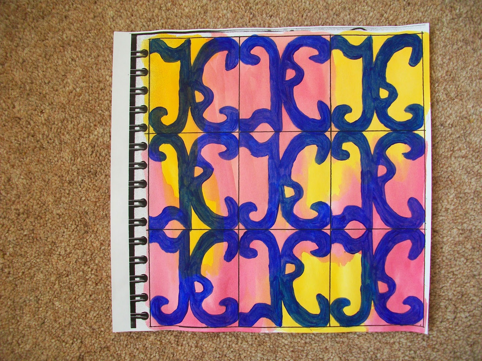
I found a nice letter K in a caligraphy book I have and made a template of it.  This first picture is the letter facing the same way each time.


This picture is flipping the letter from side to side each time.

This picture is flipping top to bottom.


This one is flipping top to bottom and side to side.

 This one is rotating the letter clockwise a quarter turn and going round the page.

All these patterns are very similar but they do create some interesting shapes.

Extra Activity.

I chose these two pictures of Rosalie Gascoyne's work.  I particularly like the 'Schweppes' one,  I like the colours and it appears to be old wooden signs that she is using.


This is my first attempt at this.  I have coloured every shape and space but my letter K is starting to look different.


This one has spaces without pattern in and is very interesting.


Activity 2.4.2  Rotational Patterns.

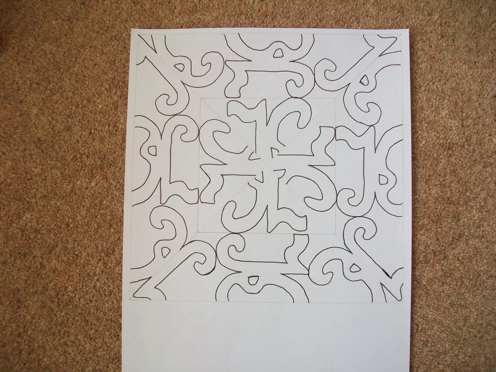
I have continued with the same template as I wanted to see how far away from a letter K the patterns could get.

This is straightforward drawing each letter in each triangle and then again in each corner.


This was the small square inside the larger one

This was three circles

This was trying overlapping letters in a circle and a rectangle.  I haven't quite got the join up correct in the circle otherwise it would have been quite good.  Very complex.

I then scanned the drawings into my Paintshop programme.  I managed to work out how to colour each shape but for some reason it did not like this one letter.  It is something to do with matching pixels I think but I don't understand it.


I had the same problem with the other pictures so I have done something different with them.


I then tried using some of the special effects on offer.  This is what the above picture would look like if I cut it up and wove it together again.

This is a kaleidoscope effect, it makes a really pretty design.

I have loved doing this chapter and realise that what I have done is only the tip of the iceberg, you could go on forever producing designs, especially when you get onto the computer as well.

Tuesday, 26 August 2014

Chapter 3 and end of Chapter 2

I took my sketchbook on holiday with me to complete the last two sections of chapter 2.  We spent quite a lot of time waiting in airports and I didn't always have my sketchbook with me but I think in future I will always try and put it in my hand luggage.  The zentangles took well over an hour each to do and I was totally in a world of my own whilst doing them.  My daughter was interested and took a piece of paper and started one of her own.

The one on the left I have used the phrase 'Take a line for a Walk' and the one on the right, I have used the word 'Serendipity'.   I really enjoyed doing these.


Writing round unusual shapes.  The first one on the left, I lost the shape after a few rows so I decided to do it again and as I was at my daughters by then, I borrowed some of the many coloured pens she uses as a teacher.  Here, I managed to keep the shape better and where I did loose it, I know what I did wrong.


This is what I followed through with from the earlier work.  The piece on the left is a shape using my initials AMC which I have placed vertically on the page and then duplicated it and filled the centre with the petal shapes.  The page on the right is the design I took from a page of letters I had done earlier using a frame.  I have then made that design larger by repeating it.  I traced the whole thing off and then traced it again but back to front so that I got a repeat pattern when I traced onto the page (hope this makes sense).  This has made an African styled design and doesn't really look like letters. 

Now I shall move onto Chapter 3.

I did these pieces before I went on holiday so I hope I have remembered correctly what I did.
These two pieces are pastels and I used some old PVA glue which spread a bit but actually made some nice shapes. I used an old plastic wallet to put the glue letters onto. The first piece is on newspaper the second on tissue paper.


The one on the left is markal stick on a pre painted thin paper.  The one on the right is markel stick on kitchen roll that already has some paint 'leftovers' on it.  I noticed that the letters weren't looking quite right and when I looked underneath I realised that the letters had come off the plastic and were moving around.  Eventually they all came off and I just had a heap of them, some had actually broken.


So I picked out the best of them and glued them into my sketchbook using superglue and then I have painted over them with Koh i Noor paints.


I did another set of letters, this time on thin card and I used candle wax to rub over them.  I don't know if the candle wasn't a proper wax but it didn't work too well.  The pages are washed with inks, the first page was tissue paper and the second was copier paper.  The copier paper worked the best but the images are still feignt.


This one was markel stick overwashed with Koh i Noor.  The glue letters are OK as this one has worked better than the candle wax.


These two are markel stick on thin cotton fabric overwashed with thinned silk paint.  The one on the left is a much greener colour background, a really lovely colour called Onyx that I didn't know I had.  I was quite pleased with these two pieces.


To finish off I painted the PVA letters with Koh i Noor paints.  This does look better than the photograph shows.

Monday, 21 July 2014

Modul 2 Chapter 2

Handwriting.

This is quite a big chapter so I have got all my books and course details spread out on the computer.  I have not done the zentangles or the extra activities yet as I will take them on holiday with me to do on the plane and will post them with chapter 3 when I get back.

Leon Ferari, Susan Shie and Dave Foster.  I looked these up on the internet and chose a picture from each one to put in my sketchbook.  To make it more interesting, I tried to do a piece of work in a similar style at the side of each picture.  Susan Shie is very colourful and obviously topical without you having to read it.


Hope these have come out OK, they don't look too good on my screen.


2.2.1

The picture above shows the first page of the next exercise.  Each piece of writing describes what I have written it with, except the first two which are biro and show my real handwriting and how I had to write at school.

Page 2 is felt tip pen and coloured pencils with the writing going up and down as well as across.

Page 3 is using the caligraphy pen again and overwriting with two fine tipped felt pens together.


Pages 4 & 5 are various ways of writing, mostly done with a fine felt tip then coloured and highlighted.
 
Adding colour
 
Pages 1 & 2 of this section.  Gold markel stick overwashed with diluted ink.  Page 2 is metallic pencils (which are not metallic at all) overwashed with water.


Page 3 is thin black card Top is written in silver pen overwashed with pearlised ink.  Second and third rows are pearlised ink overwritten with silver and gold pen.  I've then written with gold, silver and black directly onto the card to see how well they look and silver looked the best.
Page 4 is Markel stick on a piece of my painted paper from the stash.


Page 5 is painted brown paper written on first in oil pastels but they are really dry and I have now thrown them away.  I finished it off with inktense crayons used just as they are.  Page 6 is Koh i Noor background with artist ink writing using a dropper. 


Page 7 on the right is black tissue paper painted with ?  I think it is ink and then written on with a white and gold metallic acrylic paint.  The one on the left is Markel stick on tissue paper overwashed with a watered down ink.  You can hardly read the writing and you can still see through the tissue paper.

 
So I tried putting it on vaious other backgrounds and tin foil seemed to work quite well.  You can read the writing if the paper is catching the light right.
 
Pages 9 & 10.  Page 9 is a cheap grey paper used in a shoe box on which I have stuck strips of newspaper and painted it all with Koh i Noor paints.  The writing is done with a dip pen and ink.  Page 10 is one of my favourites.  It is black card with pastels writing hot words in hot colours across the page and cold words with cold colours down the page.  I sprayed it heavily with hairspray to stop it smudging.


This was an experiment but it works quite well.  It's pink florists cellophane and I have used a fine felt pen on the first piece, I then ironed it between pieces of baking parchement to shrivel it up. I liked the effect but realised that you couldn't see the writing very well so I did it again using a blue permanent marker. 

 I have missed the black and white handwriting patterns, 2.2.2 and gone straight to the colour.  I realised that that might have been a mistake because I haven't really done these right.


This first two pages, I have followed the word rather than the letter.  Having realised my mistake, I wrote another word down on paper and worked round it so that I knew what I was doing.  I then did it in my sketchbook using paint straight away and did the same mistake.  I rescued it a bit but it could have been so much better.  I think it's using paint without first drawing your design, it felt a bit bulky.  Hopefully my zentangles in black and white will come out better.


This is writing in circles.  The first one starts with a fine pen in the centre gradually getting thicker and larger letters as it reaches the outside.  This creates a tunnel effect. 


This second one is more random, using different tools and varying the size of the letters.  I quite like the effect it gives.  Also there is the addition of the permanent marker that soaked through from the other page which creates a shadow effect.


Capital Letters.
I've got plain letters at the top and bottom and curlier ones in the middle all done in ink and dip pen.  I've deliberately washed over the curly letters to make the ink run a bit.  The colour is water soluble pencils with a water wash.  I started colouring in a certain order but then got more random as I needed colour in different areas.


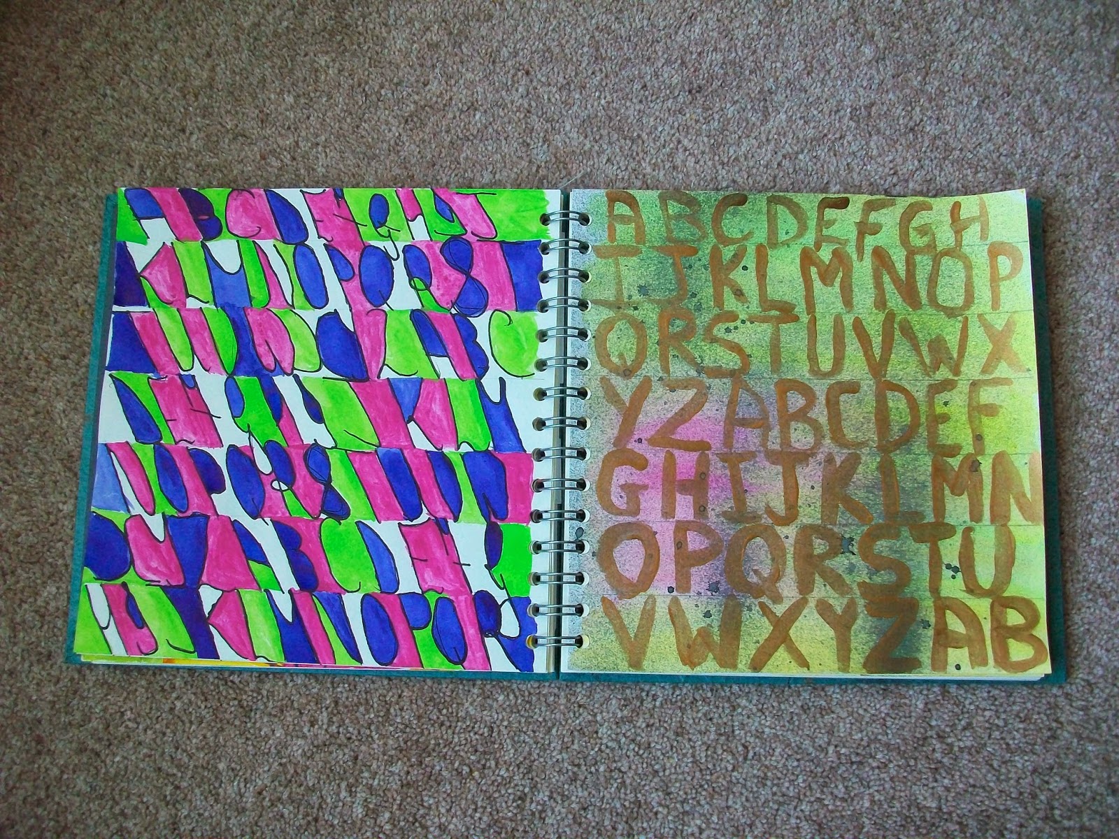
The page on the left is to celebrate left handedness.  The letters are black felt tip and the colour is koh i noor.  I really like the design this gives from a distance, you cannot see the letters until you get close up.

The page on the right is koh i noor paint with Brusho shimmer spray in charcoal (does everyone else get covered in spray paints? They seem to go backwards instead of forwards and my Gazinia on the windowsill is looking a bit darker that it did).  The writing is bronze acrylic.  I liked this page and didn't want to spoil it but I wanted to see what shapes you could get from it.

So I did a frame, drew out the shapes and then traced that off so I could create a mirror image.  The pattern it creates is quite good, I hope you can see it clearly.

This is the last extra activity.  I drew this design using my initials AMC.  I scanned it into my computer and I have managed to make a mirror image but I can't put the two together.  I don't have a drawing programme so I may do this the old fashioned way using tracing paper.  If I colour it, I will be able to to the colour changes in the same way we did in Module 1.