Friday, 31 January 2014

Activity 2.1

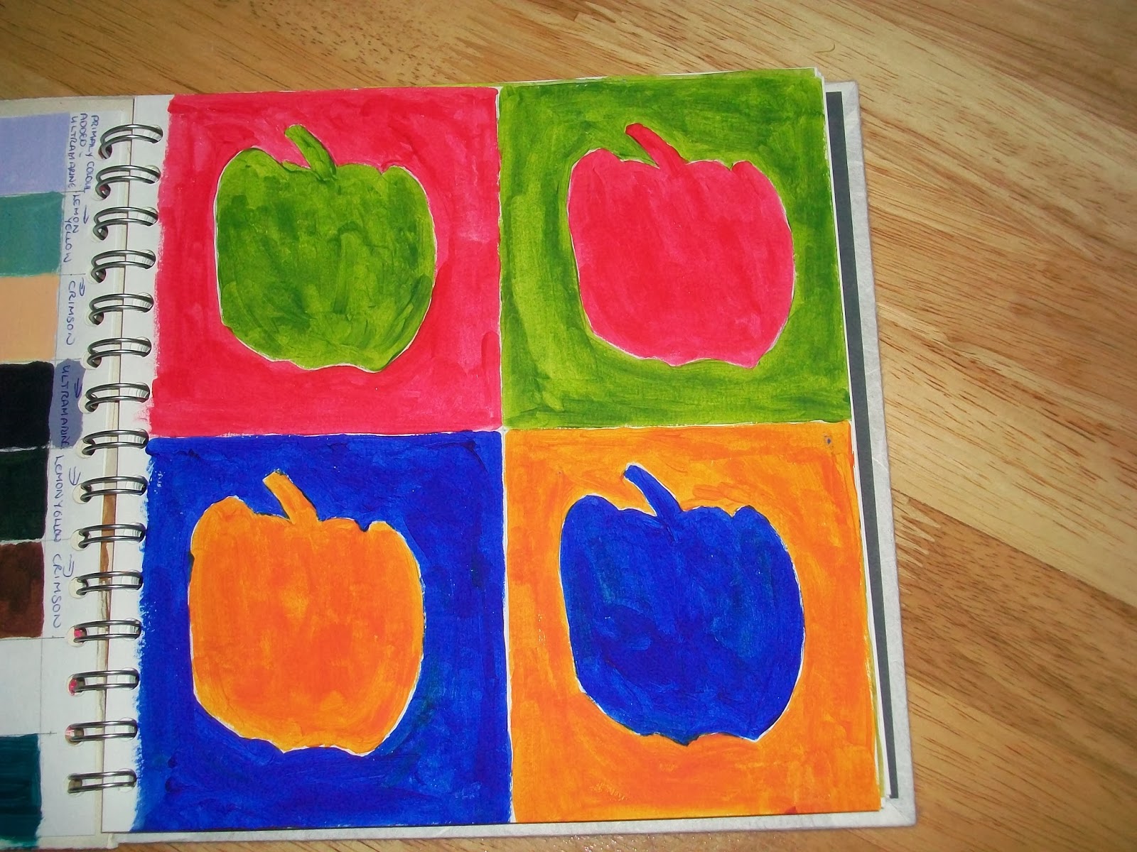
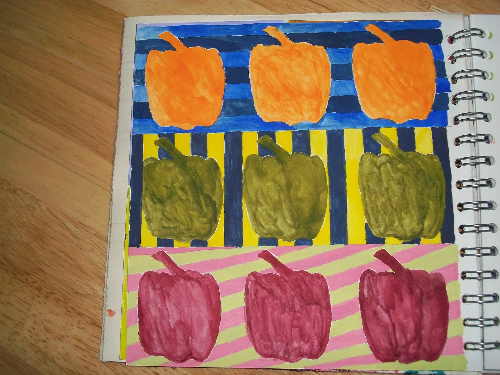
Just in case you don't recognise it, I have chosen a pepper for my shape. 


Page 1 and 2 are in acrylics.

 
The top pair are blue violet tint and yellow orange shade


On these two pages I tried out my watercolours.  I don't know what the colours are but I chose the ones nearest to the acrylics.  I wasn't sure about using them as I only have the little blocks and I am always uncertain whether I have mixed up enough colour for what I want.  However, I gave them a try.  I found purple almost impossible to get right with the colours I have got.  The bottom row is red/ violet with green/yellow and I have used the tint and shade to make a pattern.


Again I found it hard to get a violet colour, the middle row should be violet and yellow stripes with a yellow shade motif.  The bottom row is red and green. 


I didn't want to waste any paint so I painted a few pieces of paper with the leftovers. 

I am now going to crack on with the next few sections while I have some time to spare.  It is going to get busy during March, April and May.

Activity 1.5

I have been using this colour wheel already.  My sister, who paints, recommends one that moves and turns. 

I was suprised how good a purple these colours make.


Normally when going shopping I write a menu for the week and then wite the shopping list accordingly.  This week I started with the list and adjusted the menu to fit.  I should have swopped the courgette and spinach round, the courgette looks darker in the photograph.

Activities 1.3 & 1.4

I really enjoyed doing this section, I couldn't believe how the time flew by.


I now own a selection of the recommended colours in acrylic paint.  I was amazed at the range of colours they produced and together with the ones I already owned (not shown here) I can make just about every colour there is, especially greens.  My cobalt blue with cadmium yellow produces an olive green which is very useful.


The colours in the red and blue range are not so clear here.  There is a slight difference but I added too much black too soon.  On the right hand side of the first three rows I have added another primary colour to make a secondary tint, this was just to see how it worked.
Earlier this month I visited the Klee exhibition at Tate Modern and I tried to demonstrate on the bottom row, how he taught gradation to his pupils.  Divide your paper into seven sections, start with red at the left and paint the first six sections.  Paint the seventh section green and all the other sections green back to the end of the second sections.  Then paint red again from section 2 to section 5 and so on, reducing the number of sections painted each time.  I found mine just became sludgy in the middle.  Don't think I am ready for art school yet.

Activity 1.2

 
This was my first attempt. I realised straight away that I had the acrylic paint too thick and I wasn't going to get the shading required.


This is the second attempt.  The shading is better and you can just about see the pips.  I realised how much you can thin down acrylic paint, I don't think I have ever used it this thin before.  It's not much like a lemon though, more a Dahlia.

Wednesday, 15 January 2014

Activity 1

Not used to blogging about myself, I usually do blogs for groups so they are more information lead.

I have started this course using acrylic colours that I already have that are on the recommended list.  I spent some time tearing up paper so that I didn't have to stop once I had got going.  I mainly used wallpaper lining and some tissue paper that actually looked like brown paper.  I have done one page in my sketchbook and then added the others in.  I felt I was a bit short of things to work with, I didn't have an old comb or sponge rollers, etc.  but I have done as much as I think I can with what I have got.  My plan is to go shopping next week to top up my colours and get a childrens pack of painting tools. 

I normally use Koh-i-Noor paints and I have recently discovered Inktense blocks but I didn't think these would work for this activity, the acrylics worked best.


This is page 1 in my sketchbook.  I have scanned these picture in but the writing doesn't come out very clearly.  The marks in the middle are created by painting a long twisting shell and rolling it on the paper.  As the shell wasn't touching the paper all the way down, the printing is broken.


This is page 2 of my sketchbook.  I painted on a babywipe and while moving it I accidently stretched it which changed the shape of the painting so I stretched it some more and stuck it in my book.


Page 3 is on wallpaper lining paper.  I have used brushes, the end of a tube, a spray pen and a sponge


Page 4 is mostly painted with brushes in two sizes using the brush and the wooden end.


Page 5 is on the brown tissue paper.  The top is painted with thin paint and then stamped on with thick paint.  I have spattered with thin paing and used a plastic edge with thick paint to make the straight line.s

 
Page 6 is wallpaper lining paper that has been washed over with water.  I have mostly used brushes with thick pain over the wash and then after a short time I blotted it with kitchen paper, which I realise now, I forgot to keep and file in my book.
 
Of all the marks I have made my favourite is the rings done with the end of the kitchen roll tube.  Rolling the brush and stretching the baby wipe were the most suprising marks.