Monday, 21 April 2014

Module 1 Chapter 7

I do have a bit of a problem with wasting good food to print with, however I did manage to do these two.


The red and blue print was a kiwi fruit cut in half.  It didn't have a great shape but you can just see the radiating lines from the centre of the fruit, when you get close up to it.  I then got carried away and cut a mushroom in half and used that for the print on the blue paper.

The next section was potoato printing.  Here again I had a bit of a problem as I don't really eat potatoes, the only ones I have are jacket potatoes so they are all quite large as you can see from my prints.


These are the first two prints done seperately to identify them.


Printing both prints together.


I then decided that the dot one was too big and didn't offer any interesting options so I cut it in two and used the two halves to print.


I like these two.  The metalic paints are quite subtle on the painted background.

I then went on to the card printing.  I actually made my shapes from funky foam as I find it easier to cut than card, expecially if you want curved shapes.

I used the card shape I had made earlier and then I cut it again but smaller.


These are my shapes.


Here I have printed more randomly and added the paler metallic paint.  I like this print, I think the colours work well.


Here I  printed stripes.  The colours blended into each other to create their secondary colours but I found the red and yellow were the most difficult to blend into orange probably because I was adding yellow to the red.


Here I started with the turquoise blue and kept adding colours to the stamp to mix them.  I didn't clean the stamp or the brushes although I did use different brushes for each colour.  Taking a step back from all these prints and looking at them from a distance, I think they have worked out better than I thought.  I can see patterns forming in the whit lines.


The piece on the left was one of my painted sheets that already had blue metallic paint on it.  I then used a white metallic but the stamp still had some turquoise on it so I got this lovely pale blue colour.


The background is acrylic paint rollered on.  I have then used the small stamp with a mixture of metallic and ordinary acrylics and printed them overlapping each other.  I think I have overdone the printing,  the first row looked quite delicate, almost like seaweed and I wanted to try and build on that idea. 

I think that now might be the time to decorate my sketchbook cover!

Friday, 28 March 2014

Module 1 Chapter 6

I hope you can see the picture of gooseberries, I cut it out of a gardening catalogue and I maybe should have scanned it in and enlarged it. 

I did miss out the catalogue labels.

Next is my interpretation of the proportions of colour.  I think my oil pastels are a bit old and dried up as I can paint over the lines and it covers them.  I think I have got the proportions right,  mostly reds with bright and pale green.


I then did this one, changing the proportions of colour, increasing the brown and the paler red and green and reducing the darker reds and green, although by putting the bright green round the edge I have probably got a bit too much of it.


Sunday, 23 March 2014

Module 1 Chapter 5

I am just back from a few days in Bologna with my sister.  It is a beautiful city and I can well recommend it for a short break.  We walked miles through streets that are narrow and colourful and each footpath is covered with an arcade.  There are about 40 miles of them altogether.  Below are a couple of my favourite and most colourful photo's of the trip.


The lion was part of a fountain in the main square and the street was a busy main road but each house was a different colour, I didn't see two the same. As you can see, the weather was lovely, warm and sunny.

Now it is back to work.The first part was based on a picture of an avocado as it has a bit of shape without being too intricate.  I remember doing this exercise in the past with a shell and I dug out my old work and had a look at it to remind myself.  It's amazing what you find in old notebooks when you look back.  After doing a few of these arrangements I change my template and picked a broccoli leaf from the garden and traced round that.  I really liked this piece, it is more delicate.  The pink paper is an old paper bag.  I then ate the broccoli with my meal.


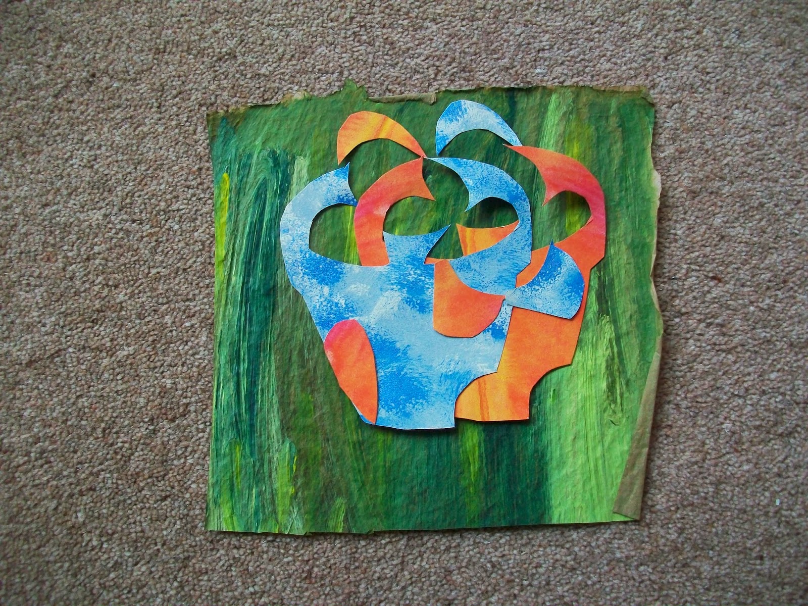
 For the next part I have photographed the pot of potatoes I chose as my inspiration and I cut out two coloured papers and chose a coloured background.   It was only after having done several arrangements I re-read the instructions and realised I should have changed the background so I quickly did a few at the end. 


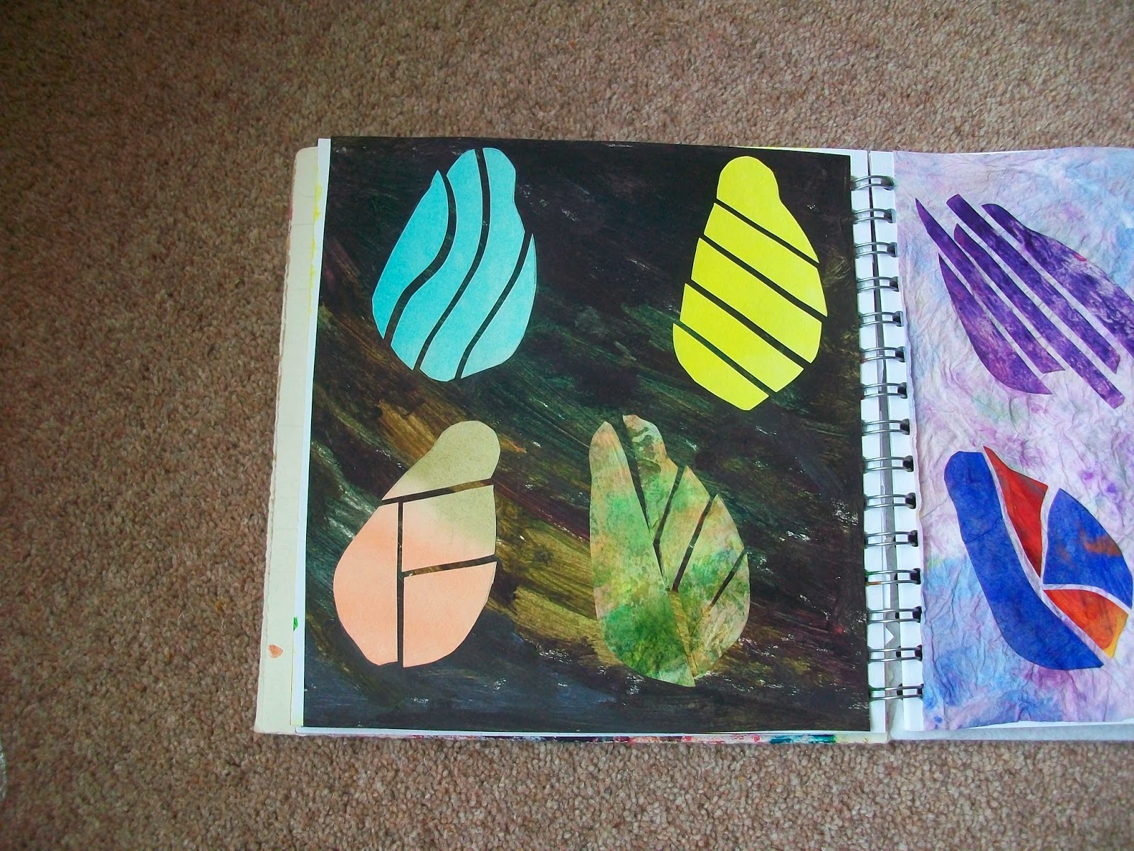
I then cut the design out of four sheets of different paper and arranged them on a dark background and then the last ones are on a blank page in my sketchbook.


The dark ones remind me of venitian face masks.  I have printed the photographs and put them in my sketchbook along with my favourite arrangements which is the second to last one mainly for the patterns it has created and the last of the earlier arrangements on the green background, again because it has more pattern in it.  I am sure I could have done even more arrangements but I had done 5 hours on my knees on the floor and they were begining to ache a bit so I stopped here.


Thursday, 13 March 2014

Module 1 Chapter 4

All these seperate activities I have done together in one big painting session.  I then had to remember what each one was but hopefully I have got it right.

I am starting with some paper I painted earlier.  This has been my favourite way of colouring paper since I learnt it with Frances Pickering.  I have used a mixture of watercolour and Koh i Noor paints onto very wet paper, colouring both sides.  You then stack them higgledy piggeldy on top of each other then wrap them in baking parchment.  The results are always lovely and I use the baking parchment two or three times to get a mix of colours.  I then paint it with acrylic wax to strengthen it and it can be used as the fly sheet in a hand made book.


These next ones are acrylic paints.  The top two are on wallpaper, bottom left brown paper and the right hand piece is a thick tissue paper that was stuffed inside a new bag.  A friend told me this technique but it didn't work very well.  You fold the paper in half and colour each side.  Place a piece of string on one side, fold the paper over, press down then pull the string out.  It should leave feathery marks but mine didn't work so well although I can see where the string was laid.  The paper was a bit thin and tore in places when I pulled the string through.


These two are Koh i Noor paints on thin brown paper.
 
 This one is inktense on wallpaper.


This is the old butterfly technique using acrylic paint for the background and ink for the overprint on wallpaper.


This is acrylic inks with cling film over the top until it dried.  Done on wallpaper
 
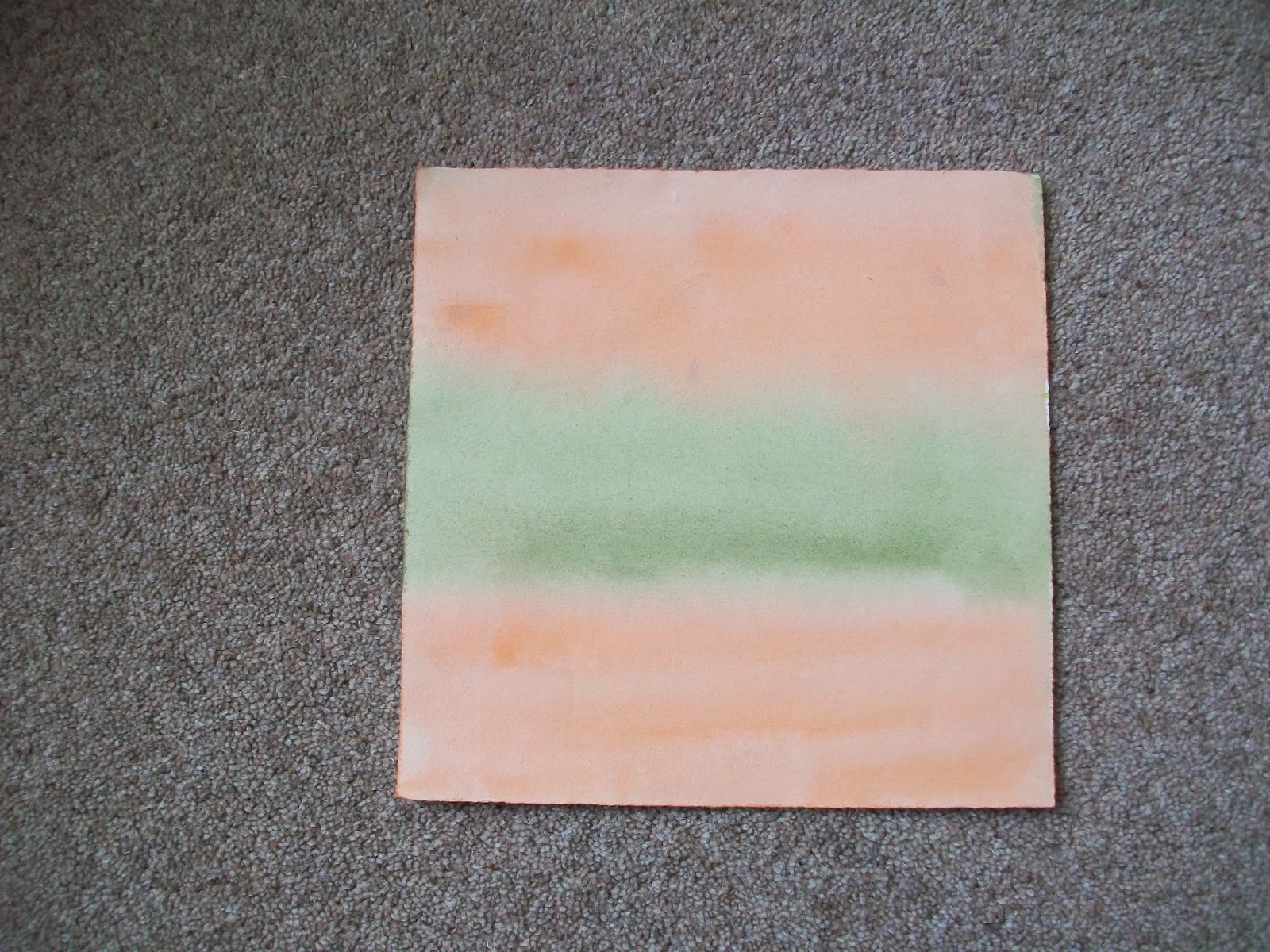
 These are all acrylic paints.  The peach colour is sprayed on using pale blue and metalic copper on hand made paper.  The shiny one to the right is painted onto brown paper.  The blue one to the left is Painted onto the thick tissue paper.  The centre one is sponged onto wallpaper and the one on the right is another attempt at the string technique using wallpaper.


Here I have rollered acrylic paint onto wallpaper for the larger pieces and hand made paper for the small piece.  I just put three blobs of colour into a tray and run the roller over them to mix them.  I have probably over worked these so that I covered the paper,  I would normally do this on textured hand made paper and just roll over once, leaving any gaps to show through.  It's a very effective technique but requires strong paper I think.

This was one of my original pieces using up left over paint.  I painted it with mod podge to strengthen it and then used alcohol inks to alter the colours and darken it.  I have used some to make a pocket to keep the grey papers in and I will fasten it into my sketchbook when it is finished.


These are the pieces of kitchen towel I used to mop up with as I was painting.  They have made some lovely pieces and I have a very good set of finger prints on one of them!

These are the ones I decided to put into my sketchbook.  The sponge painting and roller painting with acrylics.  The sponge one is purple (ready made), white and a metalic lilac.  The roller is white, purple and magenta.

Again, I have used acrylics.  The left is just red, yellow and a ready mixed green painted on randomly.  The right is acrylic background and ink for the centre.
 
I have still got the pieces I did from the left over paints so together I feel I have quite a collection now.  Looking at what I have done, I feel I have used mainly darker colours and if they have come out pale, then that was by accident.  Although thinking about it, where the paper is used wet, then the colour is paler, dry paper makes for more dramatic pieces and if you want pale, then you need to mix it.